Too often we see YouTube channels with good video content, but an empty gray space where their banner art should be. Maybe even worse is channel art that’s non-responsive or not sized according to YouTube’s specifications, with art or messaging that’s been cut off.
What a waste! Your YouTube channel art is your chance to make a good first impression, to introduce yourself and your brand, and to share any information you want viewers to know, like how often you publish, or what kind of content you share. Something like “New Game Reviews Every Friday”, for example.
Cool YouTube banners
For inspiration, we’ve gathered up some of our favorite examples of cool YouTube banners from popular channels. Before we dive into what each one does, let’s look at a few basic rules they all follow:
1. They’re responsive. YouTube channel art must be responsive, meaning it can be viewed effectively on any device — from a big-screen TV to the smallest smartphone.
Use high-resolution images and follow Google’s sizing guidelines or use YouTube banner templates (more on that below). Be sure to also stay up to date with any future sizing changes too: like other social media networks, YouTube will occasionally change the standard dimensions which can leave your banner art looking off.
2. The design is centered. Always build your design out from the middle. If you place logos, text, or images too far off to one side you run the risk of having it cut off on certain devices.
3. They’re on-brand. Your banner art should tie in seamlessly with the image you’re presenting, the kind of content you produce, and should be cohesive with other branding you have, like your website or other social media networks. Keep your logos, fonts, and color palette consistent to help create a strong visual brand.
Vanoss Gaming
One of the most subscribed channels on YouTube, Vanoss Gaming videos are usually a montage of clips from a gameplay session featuring Vanoss and his friends chatting and joking.

Why it works
Our first example is also the simplest. Vanoss’ logo incorporates the letter V into a minimalist owl design. Where many game channels opt for busier channel art, often with bright colors, cartoon characters, and highly stylized fonts, the simplicity of Vanoss’ centered logomark and black background really stands out.
If you have a strong logo associated with your brand, there’s nothing wrong with keeping your channel art simple and streamlined.
Refinery29
Refinery29’s YouTube channel features lifestyle, beauty, and fashion content aimed at millennial women.

Why it works
The minimal design and on-trend color palette is a perfect choice for a lifestyle site covering all things cutting edge. Instead of a more obvious collage effect, we like how the transparent text subtly showcases the diverse audience they speak to, and the range of topics they cover.
The Slow Mo Guys
The premise behind this popular web series is simple: fast-moving stuff in extreme slow motion.

Why it works
While lots of channels use photos of their hosts on their channel art, we like that the Slow Mo Guys skipped the standard headshot. Instead, their channel art shows the fun-loving hosts doing what they do best — making a mess in slow motion.
Smosh Games
Part of the extremely popular family of Smosh channels, Smosh Games is home to a number of different “Let’s Play” and video game commentary shows.

Why it works
While each Smosh channel has its own branding, they all incorporate the same color palette, including the bright blue and green seen here, which helps tie them together visually.
Smosh is also making great use of their channel art space to showcase their schedule. Your channel art is prime real estate — make the most of it by highlighting any important information you want viewers to see.
Mental Floss
A favorite of trivia junkies, the Mental Floss YouTube channel features videos full of fun and interesting facts on every topic, from science and history to pop culture and sports.

Why it works
Their colorful, pop-art inspired channel art reflects the wide range of themes they cover. The same bright colors and patterns are also used in videos throughout their channel for a fun look that avoids appearing too hectic.
Looper
Pop culture channel Looper is dedicated to all things related to movies, TV, and video games, especially Easter eggs, trivia, and best-of lists.

Why it works
We like the simple lines and color gradient featured on Looper’s channel art, but we especially like that these elements are repeated throughout their channel.
It’s subtle (blink and you might miss it) but each of their videos starts and ends with a diagonal wipe transition in the same colors. Particularly for a channel that often focuses on film, it’s a nice touch for their channel art to tie into their editing techniques.
Extra Credits
This channel uses animated characters to explore how games are made and what they mean, plus other topics like history and sci-fi.

Why it works
You should know by now that we like banner art that is visually consistent with the rest of the channel, and Extra Credits’ art is no exception. It incorporates the same green background and animated characters featured in the main series, plus the “mission statement” behind the show.
YouTube channel art templates
You don’t have to be a graphic designer to create cool YouTube banners. If you want to learn how to create banners like these, check out our article on the best YouTube banner makers.
Below, we rounded up a few of our favorite YouTube channel art templates from some of these popular free design tools.
Canva
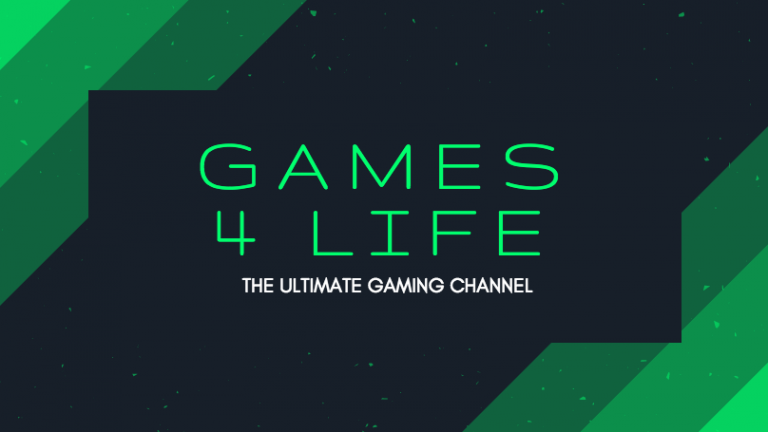
This cool gaming banner template from Canva gives you an effect similar to the Looper channel art. We think it could easily work for a science, pop culture, or technology channel too.
Adobe Spark
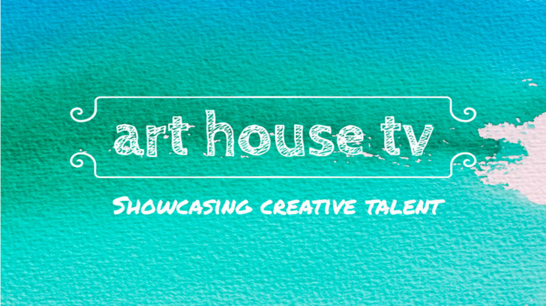
With textured paper and watercolor effects, this colorful channel art template from Adobe Spark is a great option for artists and other creatives.
Canva
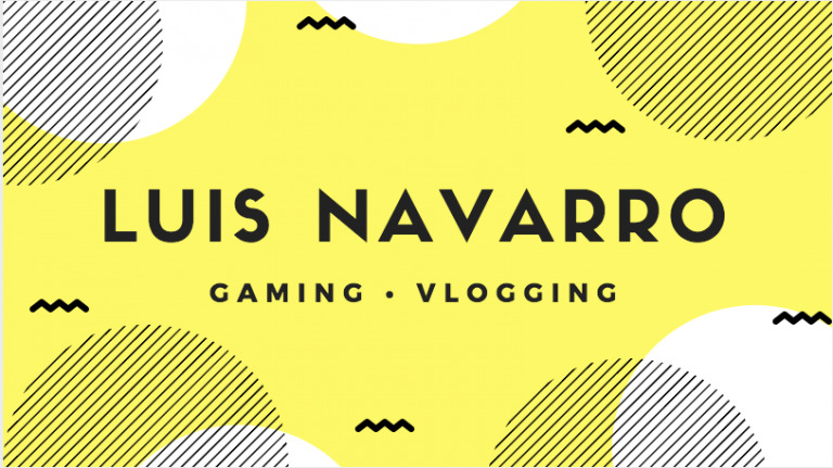
This eye-catching yellow design from Canva incorporates some fun mid-century elements. We think this versatile template could be a great option for vloggers or gaming (as shown here) or even as a design or fashion-focused YouTube channel.
Snappa
While this particular template from Snappa is a great option for DIY and how-to YouTube channels as is, it uses a tried and true design formula that works for just about any channel. Switch out the photo, icon, and text and it adapts to any theme, from beauty and fashion, to tech, design, automotive, or sports.

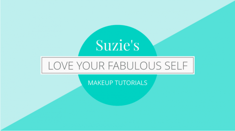
Bannersnack
Here’s another super adaptable template. As is, it’s a great option for beauty and fashion, but change the color palette and fonts and it could work for vlog, pop culture, or unboxing channels.
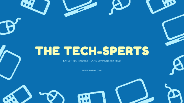
Fotor
If your channel covers all things tech, this template from Fotor might be the perfect choice.
Switch out the simple icons to make this one your own — think, lipstick and shoe icons for a fashion vlogger, or gamepads for a gaming channel.
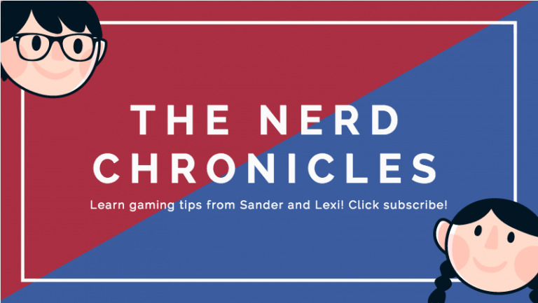
Canva
Take a look around at popular YouTube channels and you’ll often see vloggers and game reviewers using caricatures of themselves on their channel art. If you don’t have custom ones of your own, this template from Canva lets you still get that effect. Personalize the hair colors or accessories to make them look more like you!
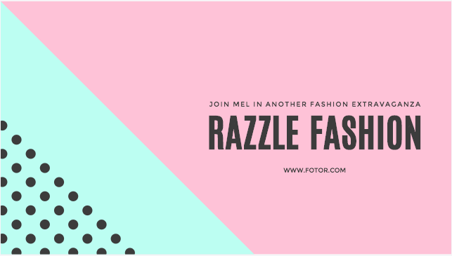
Fotor
This pink and mint YouTube channel art from Fotor is fun and feminine, with the black dots and strong fonts giving it just enough edge. It’s a great option for vlogging, fashion and beauty, or design channels.
Fotor
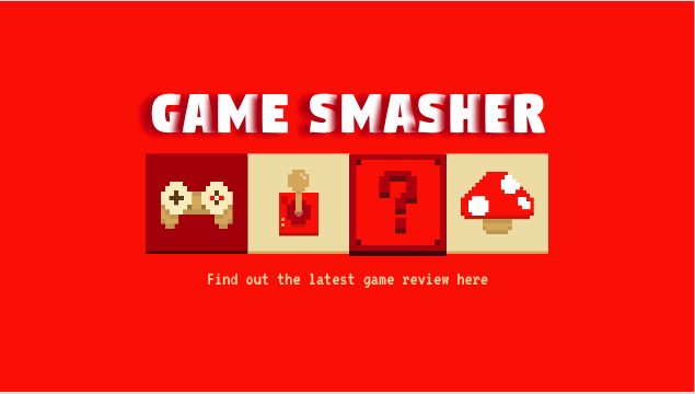
Go old school with this 8-bit gaming template from Fotor. We think this one would look equally cool with a primary color palette (think Mario Bros.), or black and neon for a Space Invaders-inspired look.
Adobe Spark
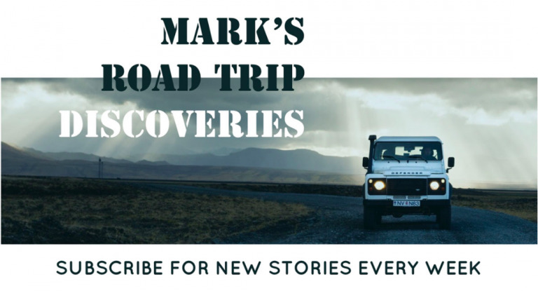
The use of white letterboxing on this YouTube channel art nicely showcases the dramatic image. Designed for a travel/adventure channel, this one would work equally well for any web series or vlog where the visuals take center stage.
Now that you’ve got your swanky new channel art sorted, it’s time to make some videos for your channel with Biteable. We have some great video intro templates here, plus a small tasting plate of four to get you started below.


