While anyone can slap some colors together, there’s an art to choosing colors that truly elevate your designs. Whether you’re creating a website, a presentation, or an announcement video, understanding color theory and utilizing clever inspiration techniques can make all the difference.
Here are 10 color inspiration secrets that designers use to create stunning and impactful visuals.
Embrace the power of the color wheel
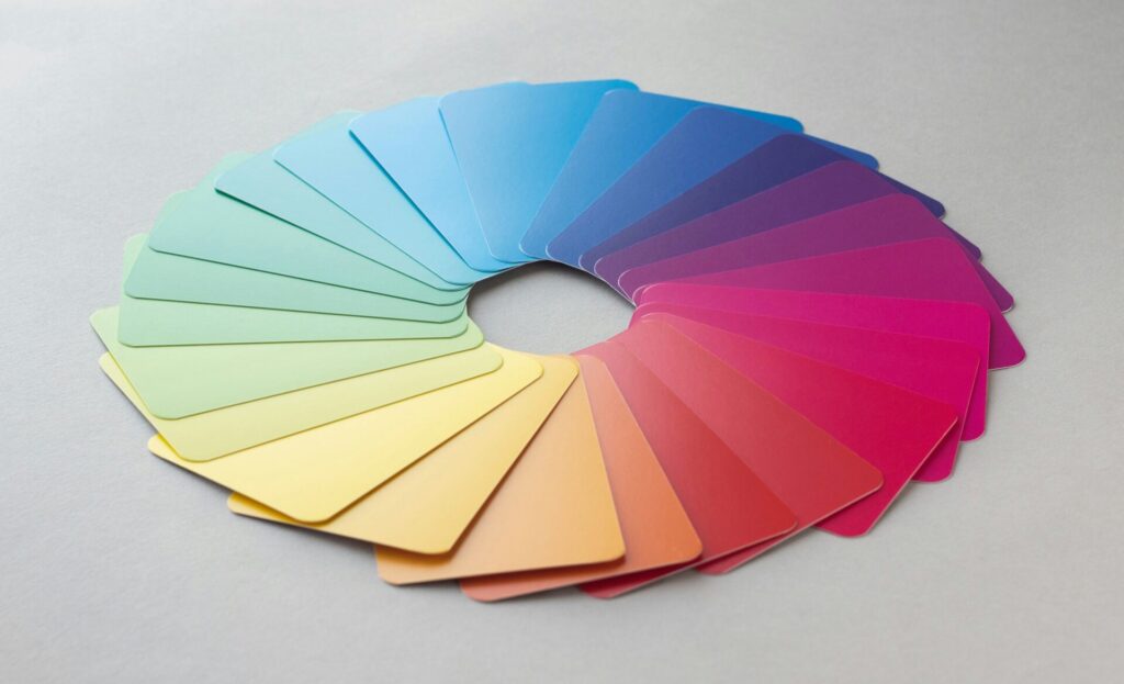
The color wheel is a fundamental tool for every designer. It visually represents the relationship between colors, showcasing primary colors (red, yellow, blue), secondary colors (created by mixing primary colors), and tertiary colors (created by mixing secondary colors).
The wheel helps you understand:
- Complementary colors: These sit directly opposite each other on the wheel and create high contrast, making them perfect for grabbing attention but use them sparingly as they can be overwhelming.
- Analogous colors: These are situated next to each other on the wheel and offer a harmonious and pleasing combination, ideal for creating a cohesive and calming feel.
- Triadic colors: These are three colors evenly spaced around the wheel, offering a vibrant and dynamic feel, well-suited for making a statement.

Capture inspiration on the go
Inspiration can strike anywhere, anytime. Designers keep their eyes peeled for beautiful color combinations in the real world. This could be anything from a captivating sunset to the vibrant flowers at a local park.
Capture photos on your phone or digital camera and use online tools like Adobe Color to extract the color palettes from your pictures. This allows you to easily translate real-world inspiration into your digital designs.

Seek color harmony in nature
Nature is a treasure trove of breathtaking color palettes. Look to landscapes, foliage, and even fruits and vegetables for inspiration. These natural combinations are inherently pleasing to the eye and guarantee a harmonious result.
For example, the earthy tones of a forest floor, the vibrant hues of a coral reef, or the calming blues and greens of a coastal scene can all inspire stunning color schemes.

Don't be afraid to experiment
While color theory provides a strong foundation, it’s important to remember that it’s not set in stone. Don’t be afraid to experiment and explore different color combinations.
Play around with contrasting colors, try unexpected combinations, and see what resonates with you. Sometimes, the most unique and impactful color schemes come from breaking the rules.
Leverage the power of online tools
There are numerous online tools and resources available to help you with your color selection. Websites like Adobe Color, Coolors, and Paletton allow you to explore pre-made color palettes, generate new ones based on seed colors, and even check for color accessibility.
These tools can be a great starting point for finding inspiration and ensuring your chosen colors are inclusive for all users.
Understand the psychology of color
Colors evoke emotions and have a significant impact on how people perceive your design. Understanding the psychology of color can help you choose colors that align with your message and target audience.
For example, red is associated with excitement and energy, while blue conveys trust and calmness. Green represents nature and growth, while yellow embodies optimism and happiness. Use this knowledge strategically to create designs that evoke the desired emotions.
Consider your target audience
When choosing colors, consider your target audience and their preferences. What kind of emotions do you want to evoke in them? What colors resonate with their interests and demographics?
For example, if you’re designing for a children’s website, you might choose bright and playful colors, while a professional website might benefit from more sophisticated and muted tones.
Use white space strategically
White space, or negative space, is the empty area around and between your design elements. It plays a crucial role in creating balance, allowing your chosen colors to truly shine.
Don’t be afraid to use ample white space to prevent your design from becoming cluttered and overwhelming. This allows your color choices to take center stage and make a powerful impact.
Test and refine
Don’t settle for the first color scheme that comes to mind. Take the time to test different combinations and get feedback from others.
Use online tools like Figma to create mockups of your design with different color options. This allows you to visualize and compare different options before finalizing your choices.
Stay inspired and keep learning
The world of color is vast and ever-evolving. Stay inspired by following design trends, exploring online resources, and immersing yourself in different creative fields.
The more you learn about color theory, the more confident and creative you become.

