A simple Google Images search for ‘Infographics’ will prove just how many infographics are out there. I’ve written an article on the basic types of video infographic here, but the problem with all those approaches is that they have been done before. How do we cut through the noise and come up with a really interesting, unique and engaging infographic design? The answer is to do something different, something that most people won’t have seen before. Below are a couple of cutting-edge infographic examples that take it to the next level and will hopefully give you some great video infographic inspiration.
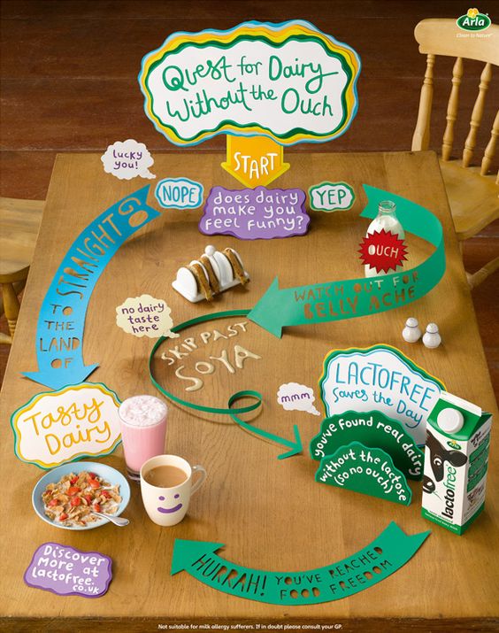
Papercut flowchart
Owen Gildersleeve is a London-based graphic designer and illustrator who specialises in handcrafted paper cut designs. Owen created this stylish but simple paper-cut flowchart for lactofree.co.uk, proving that if advertising is fun enough, people will engage with it.
Live action/animation hybrid
Information Overload is a short infographic video by Margaux Le Pierres, a New York-based designer. It combines live action video footage with low-fi animation overlays and although it is well over three minutes long it manages to remain compelling enough that you stick with it to the end.
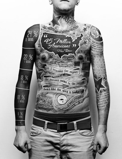
This guy got a tattoo
Okay, so he probably didn’t really get a tattoo but the Photoshop job is so good it doesn’t matter. The overall effect is so creepy and weird that you can’t look away. It’s by Polish artist and designer Paul Marcinkowski. Please don’t go out and get a tattoo.
Richard Feynman on beauty
This animated short, made by UK-based Cub Studios’ Fraser Davidson & Ben Skinner, is arguably not strictly an infographic, but has enough in common with infographics that it’s still an original take on the idea and therefore a great source of design inspiration. Most infographic videos are wordless, but this is a good example of how you can make a voiceover the star of the show.
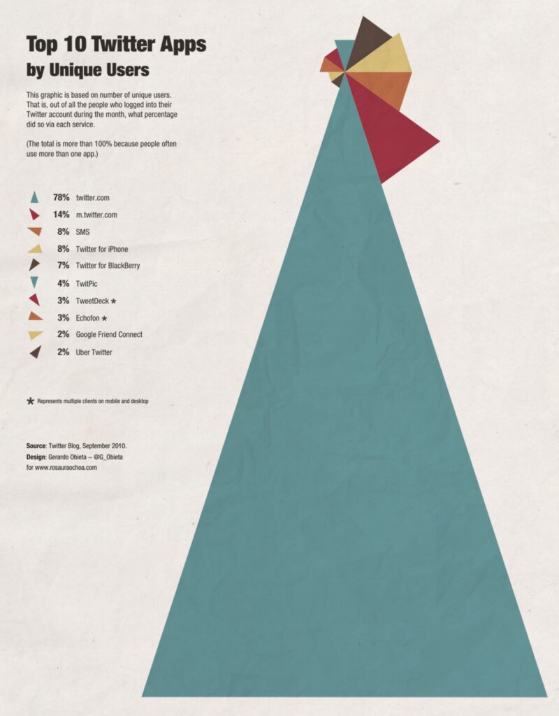
Original take on the pie graph
Something we’re seeing a lot in the field of infographics are reinventions of standard infographic formats. This simple but effective reimagining of the pie graph by Gerardo Obieta from Minnieapolis, USA, is a great example of how to do it.
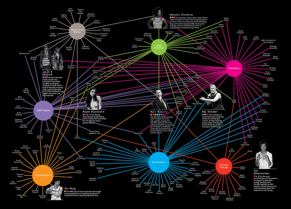
The influence map
This infographic, created by Luke Shuman for Good Magazine, charts the power of celebrity activism with a funky color palette and complex yet readable design. Good has interesting articles that are often illustrated with great infographics, so it’s worth checking out their infographic archive.
Biteable’s easy design templates
If you haven’t got the time, knowledge or resources to make the sorts of infographics featured above, Biteable is great software to help you make a professional quality video infographic in minutes, and best of all, it’s free! Click here to check out a couple of infographic templates to get you started.

