In today’s crowded marketplace, brand consistency is crucial for achieving recognition and building trust with your audience. A visual brand style guide serves as a powerful tool in ensuring consistency across all your visual communication, be it your website, social media posts, or marketing materials.
This guide acts as a roadmap, outlining your brand’s visual identity, and helps anyone involved in creating visual content to stay on message and contribute to a strong, cohesive brand image. Let’s dive into the key steps on how to craft your own impactful visual brand style guide.
Inspiration in action: Biteable's visual brand book
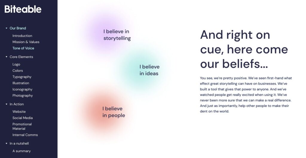
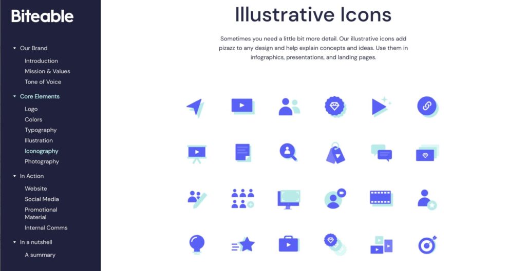
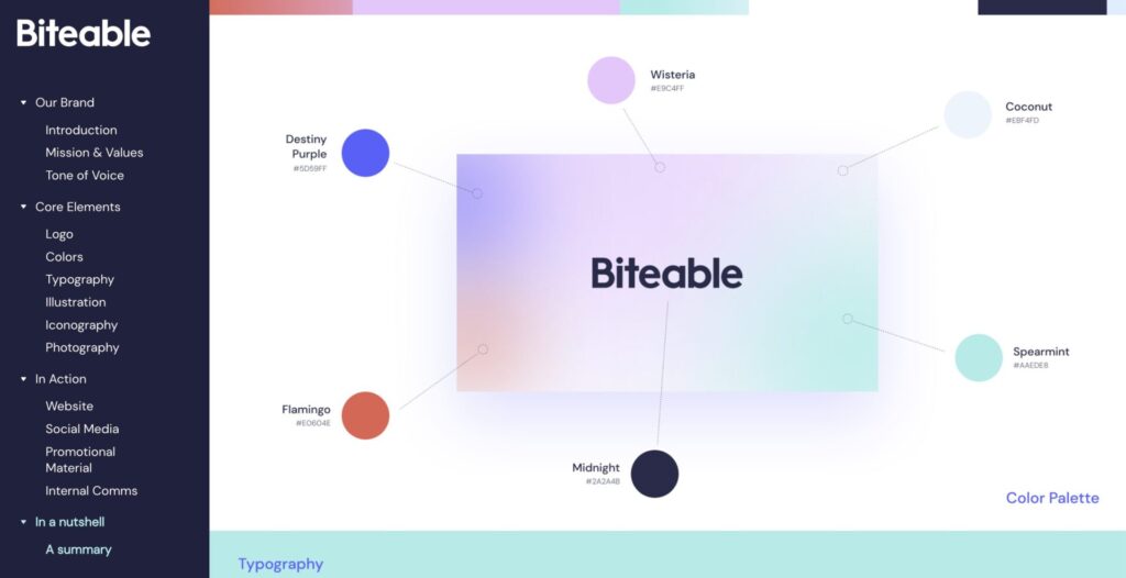
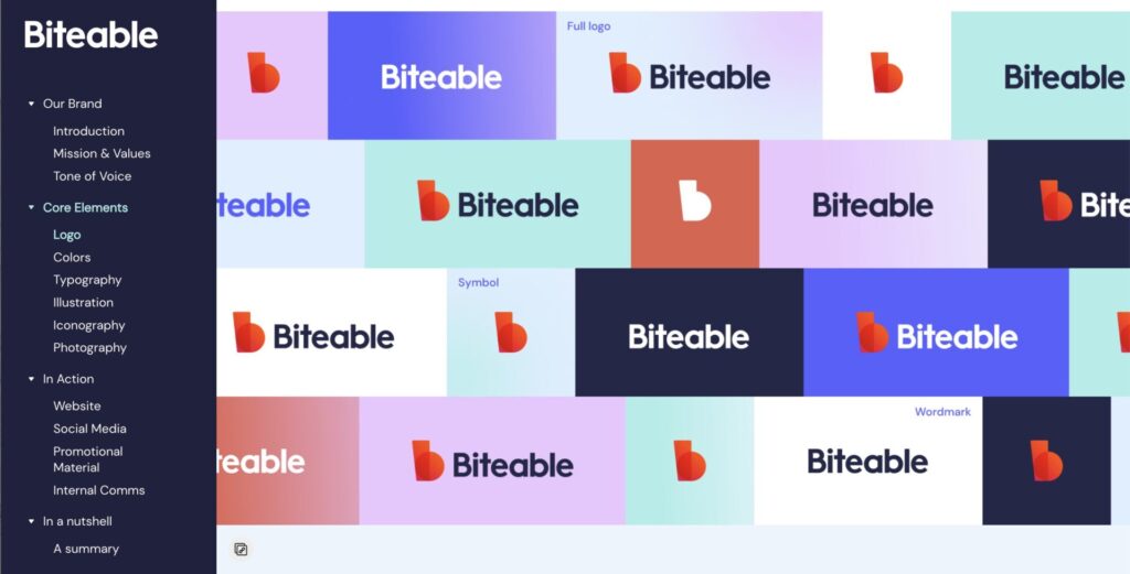
Curious what a visual style guide might look like? Take a look at ours. Biteable’s brand book is on display at brand.biteable.com and features all our best tips and tricks in practice.
Defining your brand identity

Before diving into the visuals, it’s essential to have a clear understanding of your brand’s core identity. This includes:
- Mission and vision: Briefly define your brand’s purpose and what you aspire to achieve.
- Target audience: Who are you trying to reach? Understanding their preferences and expectations can help inform your visual style choices.
- Brand values: What core values define your brand? This could be trustworthiness, innovation, or environmental consciousness.
- Brand personality: What kind of personality do you want your brand to project? Fun and friendly, professional and sophisticated, or something else entirely?
Having a clear understanding of these elements will guide your visual decisions and ensure that your brand’s personality shines through in every image and graphic you create.
Building your visual toolbox

With a solid foundation in place, it’s time to build your visual toolbox:
- Logo: Your logo is your brand’s visual signature. Ensure your style guide includes clear guidelines on logo usage, including acceptable and unacceptable variations, size specifications, and color variations for different backgrounds.
- Color palette: Choose a color palette that aligns with your brand personality and values. Include the specific codes for each color (e.g., HEX, CMYK) for consistent application across all platforms.
- Typography: Select fonts that reflect your brand’s personality and are easy to read. Define which fonts are for headlines, body text, and any specific use cases.
- Imagery: Establish clear guidelines for the style of photography or illustration you will use. This includes aspects like composition, lighting, color filters, and any specific themes or subjects that best represent your brand.
Putting it all together: Creating your style guide

Now that you have your brand identity and visual elements defined, it’s time to assemble your style guide:
- Document format: Choose a format that is user-friendly and accessible, such as a PDF document or a shared online document. We used corebook.io.
- Clear structure: Organize your guide logically, with a clear table of contents for easy navigation.
- Visual hierarchy: Use visuals effectively to showcase your brand elements and demonstrate their usage in real-life scenarios. Include examples of “do” and “don’t” scenarios for clarity.
- Accessibility: Ensure your style guide is accessible to everyone, including those with visual impairments. Use appropriate color contrast and provide alt text for images.
Maintaining your style guide
Remember, your visual brand style guide is a living document. As your brand evolves, your visual identity might need adjustments. Regularly review and update your guide to reflect any changes and ensure it continues to be a valuable resource for everyone involved in creating visual content for your brand.
By following these steps, you can create a comprehensive visual brand style guide that empowers your team to maintain consistency and build a strong visual identity for your brand.


