Think about the bright technicolor scenes when Dorothy lands in Oz, or the moody gray and black tones in a noir film. In movies and TV, color plays an important role, helping to set the tone and mood of the story.
The same is true for videos. Choosing the right colors for your video can make it more visually appealing and help to get your message across. Choosing the wrong colors can not only make your video unattractive or difficult to understand, it can make it downright headache-inducing to watch.
There’s more to choosing colors than simply matching your logo or picking your favorite shade of blue, but that doesn’t mean you have to be a designer — or even particularly artistic — to choose appealing colors for your videos. You just need to understand color theory basics.
What is color theory?
Color theory is a very broad tradition of mixing, combining, and explaining color that dates back to the Renaissance. Leonardo da Vinci and later, Isaac Newton, among others, did much to shape our understanding of color. Eventually, in the early 20th century, Albert H. Munsell developed a system of color theory based on hue, lightness and chroma that has since become highly scientific.
There’s no one defining rule when it comes to color theory, but there are some fundamentals that can help you understand how colors go together, and the moods and emotions they can elicit.
The color wheel
The first circular diagram of colors was developed by Sir Isaac Newton in 1666, and since then it’s been a mainstay in understanding colors, used by everyone from elementary school art classes, to working graphic designers and artists.
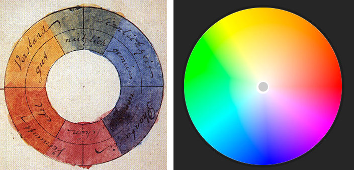
(An early color wheel by Johann Wolfgang von Goethe, and a modern one from Adobe.)
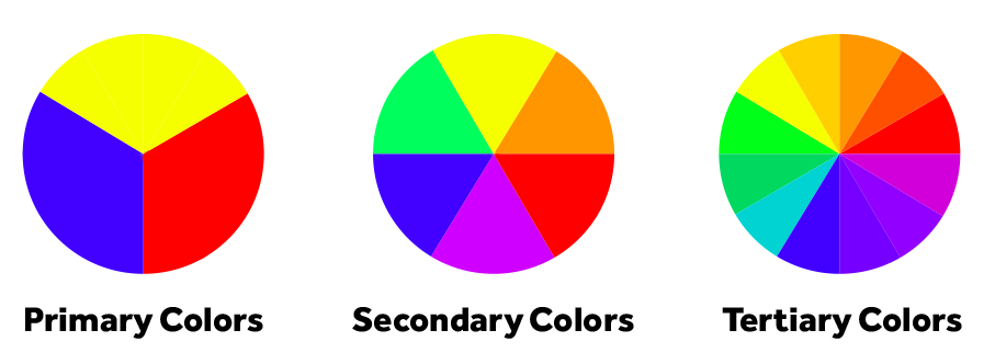
Our categories of colors are based on the color wheel. In the traditional color system developed by Munsell, these are:
Primary colors
In traditional color theory, primary colors are red, yellow and blue. All other colors are derived from these three colors and the primary colors cannot be created by mixing or combining any other colors.
Secondary colors
The secondary colors are green, orange and purple. These are created by mixing primary colors together.
Tertiary colors
There are six tertiary colors, each formed by combining a primary and a secondary color. These are: yellow-orange, red-orange, red-purple, blue-purple, blue-green, and yellow-green.
Other color systems
Other common color systems include RGB and CMYK. In these systems, there are different primary, secondary, and tertiary colors. In RGB, the primary colors are red, green and blue. Secondary colors are cyan, yellow, and magenta. RGB is primarily used for electronic displays such as televisions, mobile screens and computer monitors, and can sometimes be represented by what’s called a hex code.
Hex codes are six-digit, three-byte hexadecimal numbers used to represent colors. We use hex codes in Biteable, because they’re the default for the web. They make life easier, as they can allow us to identify a certain color without having to try and match it yourself. A hex code will be a hash followed by six numbers and/or letters, and looks something like this: #23f4a3.
In CMYK (typically only used for printing), the primary colors are cyan, yellow, magenta, and black, while red, green and blue are secondary colors. Just as in the traditional color system, the tertiary colors for both RGB and CMYK are formed by combining a primary and secondary color.
For the purposes of this article, we’ll focus on the traditional color system in which red, yellow, and blue are the primary colors.
Common color schemes
Finding harmonious color combinations is the key to creating a visually appealing video. The colors you choose should be neither bland and boring, nor too chaotic and busy to be pleasant. For video makers, you want your text or images to stand out against your background, but not to be jarring or unattractive.
As a general rule, it’s a good idea to avoid bright and oversaturated colors because they’re really hard on the eyes and look ugly.
There are a few different ways to pick colors that are harmonious. Here are a few of the most common approaches.
Warm and cool colors
The color wheel can be split down the middle, between warm colors and cool colors. Warm colors are on the red/yellow side, while cool colors are on the green/blue side, though as you can see in the graphic below, there are cooler and warmer shades of each color.
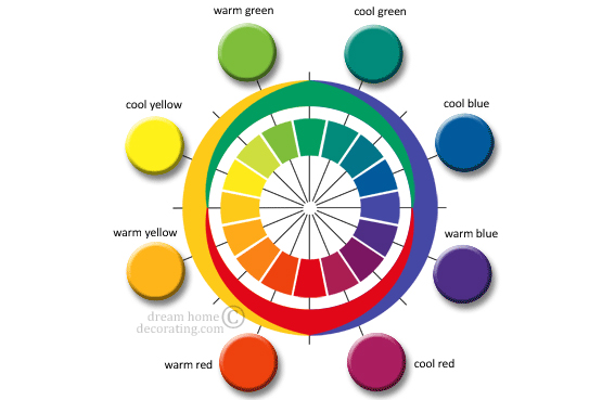
(Image credit: dreamhomedecorating.com)
Warm and cool colors can work together, as you’ll see in the color combinations below, but in general you want to avoid using too many warm and cool shades, as this can appear chaotic. It’s a better idea to pick just two or three colors that work well together.
Complementary colors
Complementary colors are hues that are opposite each other on the color wheel. Red and green, for example, are complementary colors (though you may want to avoid this combination unless you’re making a Christmas video!) Likewise, blue and yellow are complementary, and a combination you’ll see quite often.
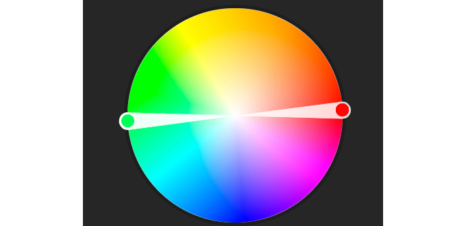
These opposite colors are strongly contrasted so they stand out against each other well, but without clashing. You’ll often find designers and video makers using one complementary color as the background, and the other to call to attention to the most important content.
Analogous colors
Analogous colors are next to each other on the color wheel. These color schemes are often found in nature, and are generally visually appealing, balanced, and nicely matched.
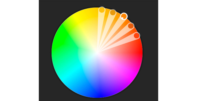
Typically, an analogous color scheme will have three colors: one dominant color, accompanied by the two colors found immediately on either side of it. Yellow, orange and red is an example of an analogous color scheme.
Triadic
Triadic color schemes are created with three colors found 120° from each other, or at each point of an equilateral triangle.
Triadic color schemes are a favorite with designers, with one color used as the background and the other two used as a main content color and a highlight color.
Monochromatic
Monochromatic color schemes use a single base color, accompanied by tints, shades, and tones of the same hue. A tint is a color with white added, while a shade is a color with black added. Tone is a color with gray added. Adding black, white or gray changes the value of the color by darkening, lightening, or muting it, respectively.
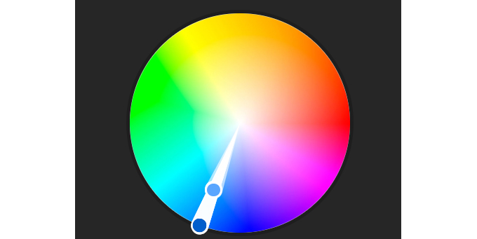
Monochromatic color schemes can be harmonious and soothing when done well, but they run the risk of appearing monotonous and boring if not executed well.
There are other color schemes out there, but these are the most common and the easiest to work with.
Color theory psychology
Colors can elicit moods and emotions in people, and different cultures attach a variety of meanings to colors. For example, the color red in American pop culture is often associated with villains. It can also symbolize anger, power, or passion. In China, the color has very different connotations, symbolizing good luck, joy and happiness.
While there’s no one rule dictating the meaning of colors, in color theory psychology, warm colors are generally thought to reflect energy, passion, and happiness, while cool colors exude a sense of calmness, serenity, trust, and professionalism. Just think of how many corporate logos are blue! However, blue can also suggest sadness or boredom, so it’s important to consider audience and context when choosing colors.
In design, cooler colors tend to be a good choice for a mellow background, while warm colors will jump into the foreground, making them ideal for a highlight or pop of color.
Using color theory in your videos
How you use color will depend on the type of videos you intend to make. Filmmakers use different colors and artistic lighting to help tell their stories — for example, think about the green lighting in The Matrix films.
However, if you’re making a marketing video for your business, you’ll likely want to stay away from overly stylized color choices, and stick to what will appeal to your audience and get your message across.
If you’re making interview or vlog-style videos, you’ll want to consider your background choices. As you can see from Wistia’s example below, your subject’s skin tone and wardrobe, your lighting, and even your viewers’ computer screens all make a difference in how you perceive the background colors.

(Choosing a Background for Your Video | Wistia Learning Center)
In general, the light grey and beige backgrounds are a bit bland and boring, while yellows and reds can be unflattering. Dark blues and greys appear professional, while bright blues and greens are fun and vibrant, but might be too frantic for conservative or corporate videos.
If you’re not sure what colors to use in your videos, try a tool like Adobe’s Color Wheel, Paletton’s Color Scheme Creator, or Coolors. These tools make it easy to create and customize any of the color schemes we’ve discussed above, or experiment with your own. If you have a logo or brand color you want to build around, you can input that and build a color scheme around it. There are also some great articles out there breaking down color scheme choices from other designers that can spark some ideas.
Biteable has also made it easy to choose the perfect colors of your video with the click of a button.
Final Thoughts
By learning these color theory basics, you can create more visually appealing, eye-catching color schemes for your videos, and be sure that the colors you’re choosing will go together.
For non-designers, it’s a good idea to stick to a tried-and-true color scheme formula, like a triadic, complementary, or analogous palette. Far from being boring or overdone, these formulas give you a wide variety of options, while ensuring the colors you choose are harmonious.
Be sure to also consider the psychology of colors and whether the colors you’re choosing fit cohesively with your brand, audience, and the message you’re looking to communicate.
A carefully chosen, well-thought-out color palette can help to make your video that much more effective at telling your story and ensuring your video is engaging for viewers.

