It’s 2am.
You’ve got a huge presentation tomorrow, but you’re afraid to go to bed for fear of having an on-the-stage-in-my-skivvies level nightmare about the big day. We’ve all been there. Learning how to make a presentation (without breaking out into a cold sweat) takes practice.
In our experience, a serious case of the jitters is best fixed by a serious injection of expert wisdom.
We’ve gathered the best advice from experts like Tony Robbins, Steve Jobs, and Guy Kawasaki on how to make a good presentation great, along with insider knowledge on both designing and delivering a presentation.
Plus, as a bonus, we included our best practices for adding video to your next presentation. We also threw in a few of our favorite video presentation templates from Biteable. With Biteable’s online video making software, creating a video presentation is as simple as making a PowerPoint (and far more effective).
Content & Design
How to make a good presentation
Making a good presentation starts with crafting the content. No matter how compelling your message is, if you don’t get it out of your brain and on to the screen in a simple way, you’ll be met with a sea of blank faces. So, where to begin?
1. Create an easy-to-follow structure
When it comes to what you have to say, break it down into three simple sections: your presentation needs an introduction, body, and conclusion.
A compelling introduction. Your introduction needs to briefly sum up what you’re going to talk about and why it’s useful or relevant to your audience.
Offer a body of evidence. The body of your presentation is where you hit ’em with the facts, quotes, and evidence to back up your main points.
Sum up with key takeaways. The conclusion is where you loop back to your original statement and give the audience some key takeaways on how they can put into practice what they’ve learned.
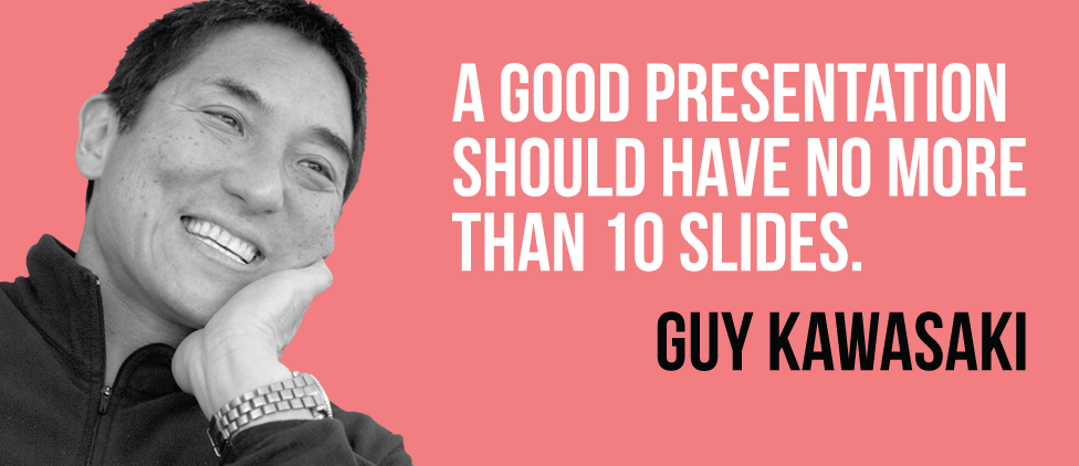
- No more than 10 slides in total. Who wants to sit through pages and pages of slides? No one, that’s who. By keeping your slide deck to 10 slides, even if your presentation is 30 minutes long, you’ll give the audience a chance to digest the on-screen messages in line with your talk. Using concept maps before structuring your slides can help keep to the point.
2. Limit the amount of copy on each slide
Less really is more, especially when it comes to making a good presentation. Too much text and the audience will just be reading the screen instead of looking at you and feeling the emotional impact of your message.
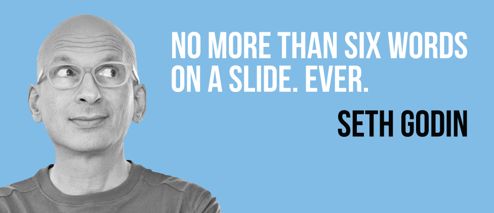
No more than six words per slide. Marketing king Seth Godin says we should have just six words per slide – that’s not a lot of copy. Choose your words carefully and rewrite until you’ve got it just right.
- Think ‘bite-size’ information. We called ourselves Biteable a reason: studies show information is retained better when it’s broken down into bite-sized chunks. Video is a great way to do this, and research suggests it’s 95% more compelling than text. Consider adding video to your presentation strategy. But regardless, break your information up into smaller, palatable pieces.
3. Be savvy with design details
A well-thought-out design can make all the difference between a good presentation and one that falls flat. Consider these design standards as you make your presentation.
Use color sparingly. Bright colors can dazzle, but too many can be off-putting. Use the colors most relevant to your message. We’d recommend sticking with one or two (not counting black and white) for your palette so it has a consistent look and feel.
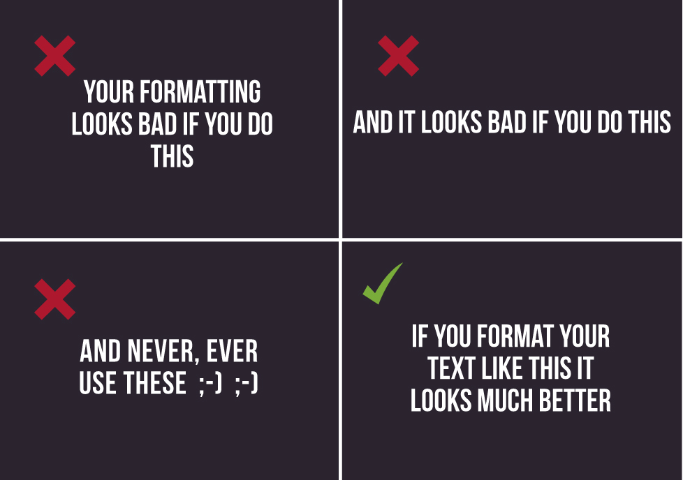
Be consistent with your font. Consistent design makes you look more professional. Don’t switch between caps and lower case, Times New Roman and Comic Sans, or 8 and 30 point text size. Stick with one font and one size throughout. You can vary the emphasis with your words later, but keep your on-screen text uniform for a more cohesive message.
- Format for perfection. A wonky line on a slide or a badly pixelated graphic will put some people off, as it will look like you haven’t tried very hard (or worse, that you just aren’t very good). Make sure your text is aligned and neat like in the example below.
4. Polish several times
Just like a pair of well-worn shoes, a good presentation often needs a few rounds of dusting before it’s shiny and sparkly.
Start Messy. Don’t be afraid to start messy. Using a non-linear writing tool like Milanote allows you to explore and outline your initial ideas in a flexible way before you even open up PowerPoint or Keynote. Arrange your ideas side-by-side and discover new connections that you didn’t see before.
Edit ruthlessly. At first you might have a huge amount of information and will wonder how you’re ever going get it down to six words per slide. That’s OK. Keep editing ruthlessly until you’ve pared your message down to the bare essentials.
- Get someone else to look at it. A fresh pair of eyes can work miracles when it comes to refining your presentation. Get a trusted mentor or colleague to review your work. If you don’t know anyone who can help, an online writing assistant like ProWritingAid or Grammarly can help you weed out a lot of problems.
Delivery
How to give a good presentation
How you deliver your slides is as important as their content and design. Here are some quick pointers to help you get your message across with impact.
5. Have a strong opening
How you start and finish your presentation is extremely important. Audiences usually make up their minds about someone in the first seven seconds, so make those first moments count.
Be different. You’re doing a presentation about saving tree frogs in Costa Rica. You open with an amusing story about one that escaped on a bunch of bananas to the UK. A story like this is different and unexpected for your audience, so they’ll sit up and take notice.
Ask a question. Rhetorical questions are a great way to frame a topic and introduce ideas. Martin Luther King Jr. said: “There are those who are asking the devotees of civil rights, ‘When will you be satisfied?’”
- Tailor it to your audience. How much do you know about your audience? The more you know, the better. Especially if you know their likes and dislikes. Inserting a relevant metaphor or popular culture reference. Oprah Winfrey’s Stanford commencement address spoke to the graduates about her lessons learned and how they were entering ‘the classroom of life.’
6. Be genuine
Oscar Wilde said “Be yourself; everyone else is already taken.” A lack of authenticity will be spotted a mile away. Whatever you’re saying, speak from the heart and don’t try to impress – there’s no need to prove yourself, just to get the point across as you see it. After all, that’s why you’re there, and you can’t do more than that.
Use humor. Humor can be great for giving a presentation, but cut it out if it feels like a stretch. Telling a humorous story can break down any barriers, make you more likeable, and make your message more memorable (and people are surprisingly generous with laughter) but the faintest whiff of desperation will kill a funny vibe.
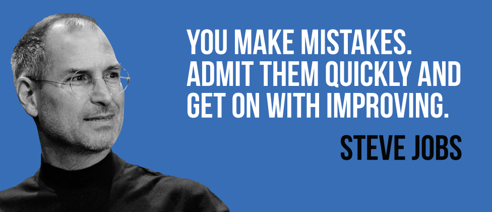
Don’t be afraid to mess up. The fear of making a mistake can make you inordinately nervous. Relax, even the best speakers mess up or have bad luck. Theresa May, ex-Prime Minister of England, once stumbled and coughed her way through a presentation, with someone even handing her a resignation letter. She battled through like a pro, though, and simply acknowledged it and moved on. No big deal.
- Open up and be vulnerable. Brené Brown, a researcher whose presentations have amassed over ten million views, says that “Sometimes the bravest and most important thing you can do is just show up.” This means speaking your truth and daring to feel a little uncomfortable as you share a meaningful story. It will connect your audience to you like never before.
7. Have a plan for a smooth delivery
With all the prep you’re doing on the content and design of your presentation, it can be easy to overlook other variables that are within your control for a stress-free delivery.
Have a practice run-through. There’s nothing like reading it out loud to ensure your message makes sense before you actually deliver it. Try recording your presentation on video — this way you’ll be able to review with an accurate eye and notice whether your speech matches up with your slides. It’ll also help you sort out your run time.
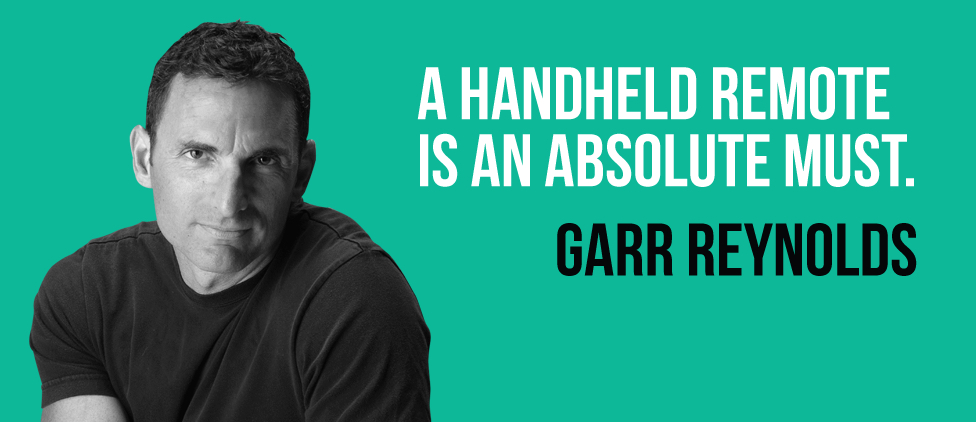
Use a remote. A clicker or remote will help you face the audience and not have to keep turning back to your laptop. Sought-after public speaker Garr Reynolds says a remote is essential in order to pause and advance your presentation so you have time to be spontaneous and control the flow of your delivery.
Have backup material. Not everything you say is going to resonate with your audience. It’s best to be flexible enough to change the game as and when needed. Steve Jobs had standby anecdotes prepared to fill time when the technology he was using to give the presentation failed. Preparing for every eventuality will help soothe your nerves and allow you to feel more in control.
- Use a timer. When you get into the flow of your message, it’s easy to go off on a tangent or even spend too long on audience questions. Put your phone on airplane mode and set the stopwatch just as you begin speaking. A quick glance down at the table during a pause will allow you to make sure you’re not going overtime.
8. To conclude, focus on audience value
You’re coming to the end of your presentation. How do you wrap it up in a way that will be everlasting in their memories? The experts recommend you focus on the feeling you want the audience to take home.
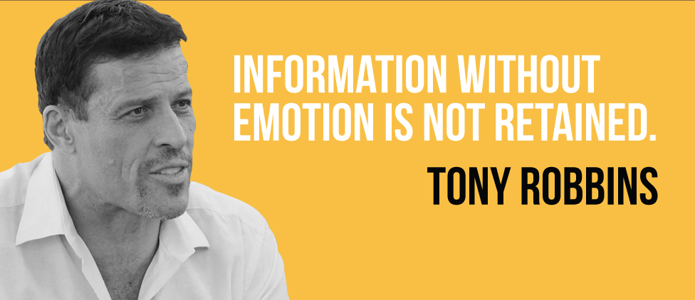
Leave your audience with an emotional impression.”They might forget what you said, but they’ll never forget the way they made you feel” said the poet Maya Angelou. By leaving them with an emotional impression, from a piece of video with moving music to a line from a song or poem, you’ll strike that resonant chord and end on a high.
Use a pause for key takeaways. Want the audience to remember something specific? Say it slowly and leave a pause at the end. The silence will emphasize what you said and make it meaningful.
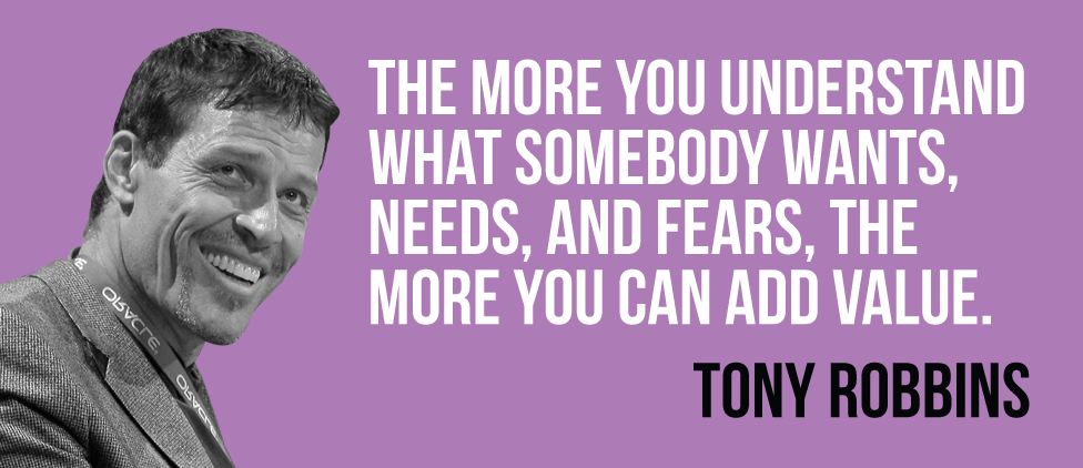
- Make your core message sing. A call-to-action is the best way to wrap up your presentation with strength and impact. What do you want your audience to do next? Tony Robbins tells a great story, moving his audience emotionally towards change.
Make your next presentation shine with one of these video templates
You’ve learned from the pros and you feel much more confident about how to make a presentation that stands out. But to really make your presentation one to remember, consider adding video into the mix.
Create a nice change of pace by embedding a video in your PowerPoint presentation or go out on a limb and turn your entire presentation into an engaging, thoughtful video.
Either way, make it great with one of the professionally designed video presentation templates available in Biteable.
Make a video presentation with Biteable
With Biteable, making a video presentation has never been easier.
Biteable’s online video making software gives you access to hundreds of brandable templates and video scenes, plus over 24 million stock clips, images, and animations all in an easy-to-use platform.
Add text to your video, include a voice over, and even record your screen without ever leaving the app. Once you’re done making video presentation magic, automatically apply your company colors and logo to your entire video with Biteable’s innovative brand builder feature.
Anyone can make an impactful video with Biteable. Are you ready to try?


