Video design basics: How to make great videos

If it’s not your day job, video design can feel like a mystical art. Thankfully, it’s not. Video design is straightforward and logical, once you know the rules.
Graphic illustration of a video player interface with design elements and color swatches.

At Biteable, the world’s simplest video maker, we spend a lot of time making video templates. We’ve made more than a thousand and, along the way, we’ve figured out exactly what makes a great video.

In this article, we pull back the curtain and explain how to make your videos look like they were made by a professional.

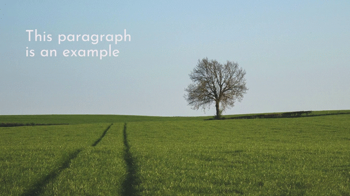
First, we’ll run you through the basics of good design, then we’ll teach you how to get your font choice right, how to pick colors, and how to arrange elements on the screen.

When you’re done, you’ll know the secrets behind our jaw-dropping video templates and you’ll feel confident making and editing your own videos.

Design basics for a beautiful video

It comes down to this: good design helps deliver a video’s message; bad design detracts from it. With these general design tips in your video-making toolkit, you’ll be able to nail video design every time.

1. Keep your video elements consistent

Cling to consistency across the board. If your video includes footage, use footage that complements other footage you’ve chosen.

For animated videos, stay within the one animation style. For example, here at Biteable, we have a set of Frank animations. Frank looks pretty different to our Diverse Workplace characters, and mixing them together would be a no-go.

The same goes for fonts, colors, and all the other visual elements that make up your video. Establish the visual style of your video and stick to it.

Create videos that drive action

Activate your audience with impactful, on-brand videos. Create them simply and collaboratively with Biteable.

2. Don’t mix footage with animation

Video footage and animation go together like socks and sandals — it doesn’t look good most of the time. Stick to one style or the other — whichever will help you get your message across best.

Animations can be handy to help explain something, whereas video footage is great at creating an emotional impact on your audience or physically representing your product or service.

This rule can be broken, but proceed with caution.

3. Choose footage wisely

Whether you’ve filmed your own footage or plan to pull from Biteable’s stock library (stock footage is a masterful time and budget saver), avoid blurry footage or anything that looks cheap. Clean, crisp, and modern footage is the key to professional-quality videos.

Even stock footage can vary in quality. Do your due diligence and watch over any footage before selecting it for your video.

4. Don’t go crazy with color filters

Color filters allow you to change the color of your video footage. It’s not a subtle edit, and when overused it’s an easy way to impact the quality of your video.

Add a darker color filter to make light text more legible on a lighter background, but do it sparingly. You generally want to avoid color filtering footage and images within your video unless you’re going for a very specific style.

Play Video

This pitch video shows you how to get color filtering right. The color filters help the text to pop and moves the supporting imagery deep into the background.

5. Use your logo

Increase brand awareness and add credibility to your videos with a logo.

Videos from small businesses and big brands alike should feature a logo somewhere in the video to increase brand awareness. Adding an animated effect to your logo is a great way to jazz things up and add a little professional pizzazz.

Play Video

Take a look at some of the ways you can bring your brand’s logo to life with animation. Even better, you can do it in just a few clicks.

Text size and fonts

Align your text with video design best practices using these three vital text tips. Not to be too bold, but these tips are worth underscoring.

6. Know what your font is saying

Fonts have feelings, too. Or rather, different fonts convey different feelings to the person viewing it. The personality of the font you use should suit the subject matter of your video.

Most business videos use a sans-serif font for easy-to-read, clear communication. But if you want your video to look classy, try a serif font. For a fun and friendly video, choose a display font to match the video’s vibes.

Filter via font types and categories on a platform like Google Fonts to narrow down the right font for you.

7. Keep font size the same throughout

Again, consistency is crucial. Text should always be the same size, line height, and font. Titles are the exception here — titles can be a bigger and different font — but every title should be the same as the other titles.

You might also break from the mold to emphasize words but do so sparingly for optimal effect.

8. Keep your text box alignments aligned

If your text is on the left of the screen, it should be left-aligned. If it’s in the middle, align it in the center. If it’s on the right… you get it.

Avoid grouping text boxes with different alignments together — you don’t want a center-aligned text box sitting just below a left-aligned text box, for example. Even if you’ve positioned the text to look aligned, it’ll still look a little off.

In other words, don’t do this: 

A solitary tree stands in a green field with tire tracks leading towards it under a clear blue sky, overlaid with a template for a title and body text.

Choosing the right colors for your video

Color can breathe life into your video design like nothing else. Brush up on our color-picking dos and don’ts below.

9. Choose colors carefully (and thoughtfully)

Don’t pick unappealing colors. That’s what this boils down to.

Choose colors that complement the other colors you’ve chosen, the style of your video, and your brand’s style guide. For example, corporate videos typically stick to more conservative colors like blues and greys or the established brand shades.

Generate eyeball-approved color combinations with a website like coolors.co to avoid avoidable color-clashes.

10. Know your dominant colors

Limit the potential for color clashing by sticking to two dominant (typically contrasting) colors and a third minor color. Working with the same few colors keeps your video consistent and doesn’t detract from your video’s message.

Your initial color choices aren’t carved in stone. Try different color combos if your video isn’t feeling right — you might be shocked at what a new coat of paint can do for your video’s look and feel.

Video layout laws

Get a feel for the layout of a well-designed video with these placement basics. Symmetry of elements (or lack thereof) is probably one of the easiest ways to separate an amateur video from one made by a professional.

11. Be wary of the edge of the screen

Give the edge of the screen the space it needs to thrive. Keep text away from the edges to avoid a video that feels crowded. You never want to place text in the exact corner of the canvas or hard up against the outer edge of your video.

If the innards of your video don’t fit without crowding the edges of the screen, you’re probably trying to fit too much in. Consider splitting the content into multiple scenes or culling down to only the most essential parts.

Comparison of acceptable and unacceptable text placement on an image of a solitary tree in a field.

12. Perfectly center anything near the middle

Do your viewers a solid and make sure anything near the middle of the screen is perfectly centered. Follow the red guidelines in the Biteable video maker, or whip out a ruler if you really have to.

Comparison of improper and proper text alignment on a background image.

13. Keep things on the same line

If you’ve positioned your text near the top, middle, or bottom of your screen, make sure it’s always on the same line throughout. Keeping everything aligned will avoid your text jumping around the screen and keep your transitions as smooth as a hairless cat.

You’ll also want to keep your margins consistent throughout by leaving the same distance between your text and the screen edges in every scene.

Avoid this:

Aim for this:

Editing for tempo and timing

When you’re cutting your video together, you’re at the helm of the ship. The pace, energy, and well-timed edits will guide you safely to shore.

14. Keep things snappy

The faster the cuts, the harder it is to lose your audience’s attention. Make your video more exciting by occasionally flashing one or two words on the screen for a second or so — just enough time for an engaged audience to read it.

Fast cuts and a quick pace result in fun and dynamic videos that battle boredom.

Play Video

A satisfactorily snappy video might look a little something like this.

15. Remember: Your audience (probably) aren’t speed readers

Ensure your video isn’t too quick and snappy that it’s leaving your audience behind. Check the timing of scenes with text to make sure there’s enough time for the average person to read it comfortably.

Polish your video by watching it through from start to finish to check the pace of the scenes, keeping an extra eye out for readability.

16. Time to your music for extra points

Time a significant transition in your video’s content to a music change or beat drop to get a little fancy. Everything is more impressive with a swelling soundtrack playing in time with it.

Play Video

The text timed perfectly to the music is what gives this video its epic feel.

Manage your video’s mood with music

Master defining the mood of your video with these tips for your tunes. Set the scene with a music track that matches your message.

17. Match music to the mood of your video

Aside from selecting a clear, high-quality track, the most important part of picking music is matching it to your video’s goal. Choose music that suits the mood of your video and enhances rather than detracts from your message.

If it’s a fun video, keep the music bright and upbeat. If it’s a corporate presentation, go with something more sedate and simple.

18. Know your way around royalty-free music

Ensuring you have the rights to the music you’re using is especially important if you plan to put your video online. Stick to music you have a license for or explore the best royalty free music sites to find what you’re looking for.

The Biteable online video maker contains 100+ free music tracks to add to your videos, from jazz to rock to funk and just about everything in between. As a bonus, they’re also attribution free, which means you don’t need to credit where the music comes from alongside your video.

Design a fool-proof video with Biteable

Biteable is the world’s simplest video maker and offers you 1000+ ready-made templates as a starting point for your video creations. Every video is ready for you to customize to your brand and your taste.

Put your newly learned video design skills to the test with a template or a blank canvas and craft a beautifully designed video in minutes.

Contents

Make stunning videos
with ease.

Take the struggle out of team communication.

Try Biteable now.