How do you create a winning Facebook ad?
Facebook attracts a lot of people — 1.47 billion of us log in every day.
The competition for our attention is heating up too. As more companies flock to Facebook to get in front of their dream audience, how do you make your ads stand out?
The real secret to crafting a high-converting Facebook ad is this:
Your ad needs to make your target audience want to do what you’re asking them to do. It has to fill them with the desire to discover what’s on the other side of your ad and take the action outlined in your CTA — whether it’s to “learn more” or “buy now”.
But even if you know your audience really well, we all need a little creative inspiration, something to spark those winning Facebook ad ideas. That’s why we’ve put together this inspo-triggering list.
Killer Facebook ad examples for inspiration
While it’s hard to judge an ad outright without knowing its conversion rates, there are some best practices that will make your Facebook ad stand out.
An effective Facebook ad should be clear, concise, on brand, and make you want to click.
Let’s take a look at some ads in industries as diverse as investment and real estate that do just that.
The social proof ad: woo readers with testimonials
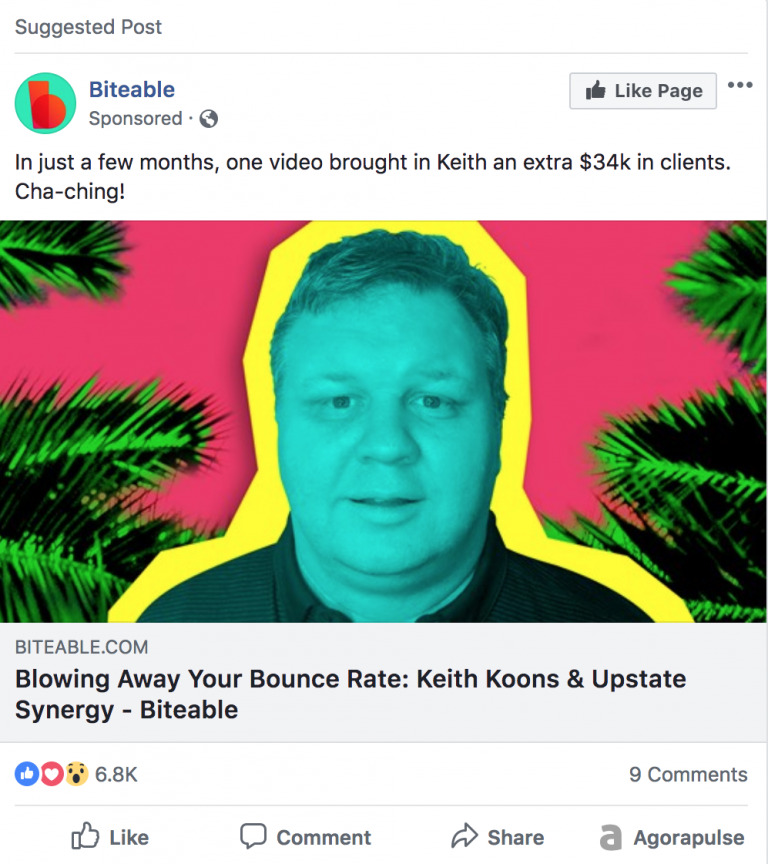
Social proof ads — using case studies or customer testimonials to highlight user success — can be incredibly effective.
This type of ad is specific and shows readers a concrete example of what they can achieve with your product. They help build trust by showing viewers that you’ve already helped others do what they want to do.
This ad, featuring one of our case studies, teases a specific result and prompts the reader to wonder: how do I get those results?
So if you want to get leads, look at the testimonials and case studies you’ve already got. How can they can help you spark curiosity and gain an edge?
The real estate ad: use location to stand out
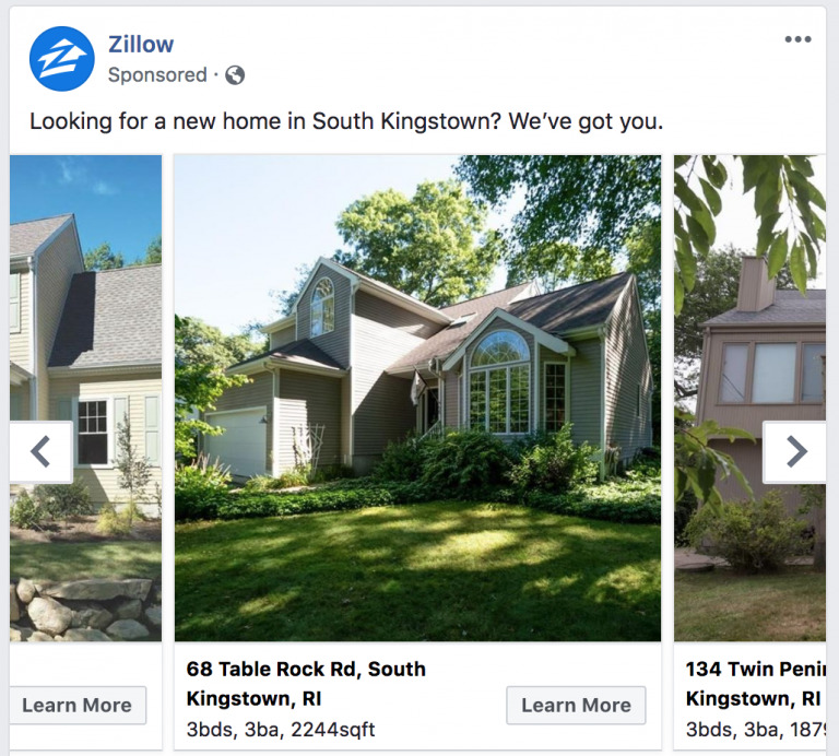
This ad from Zillow is simple and traditional. It’s location-specific and targets people looking for a home in a defined area — that’s a great way to reach an interested audience.
According to Consumer Acquisition, choosing the right image is absolutely crucial for an ad’s success. If this is so vital for normal ads, how much more important is it for the real estate market where images can make or break a property?
Zillow keeps it simple, with well-lit outside shots that specify the home’s amenities and location — crucial info for interested buyers. This level of specificity and localization is perfect for location-based businesses.
The book ad: tease the plot
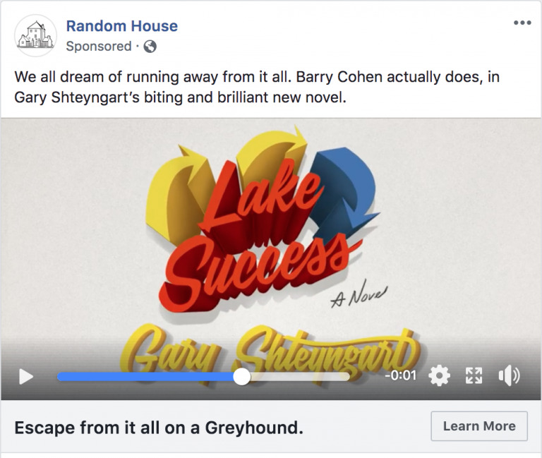
This book ad from Random House teases the release of a new novel with a short video.
Instead of digging too far into the plot, we’re just given a single sentence — one that sparks curiosity. What happens when Barry Cohen does run away? And is following that dream worth it?
Use curiosity to tease the reader in your own ads, experiment with shorter variants like this one as well as longer-form stories to see which ones perform best with your audience.
The financial services ad: keep it simple
This ad from Edward Jones features a clean video with a combination of motion graphics, simple fonts, and their brand colors.
The ad highlights the personalized attention Jones advisors are known for while its simplicity acts as an antidote to the rest of the busy ads and in-feed messages vying for your attention.
You can make similar simple ad videos with Biteable’s pre-made Facebook templates — and have your next successful ad ready to go in minutes.
The insurance ad: who said insurance had to be dull?
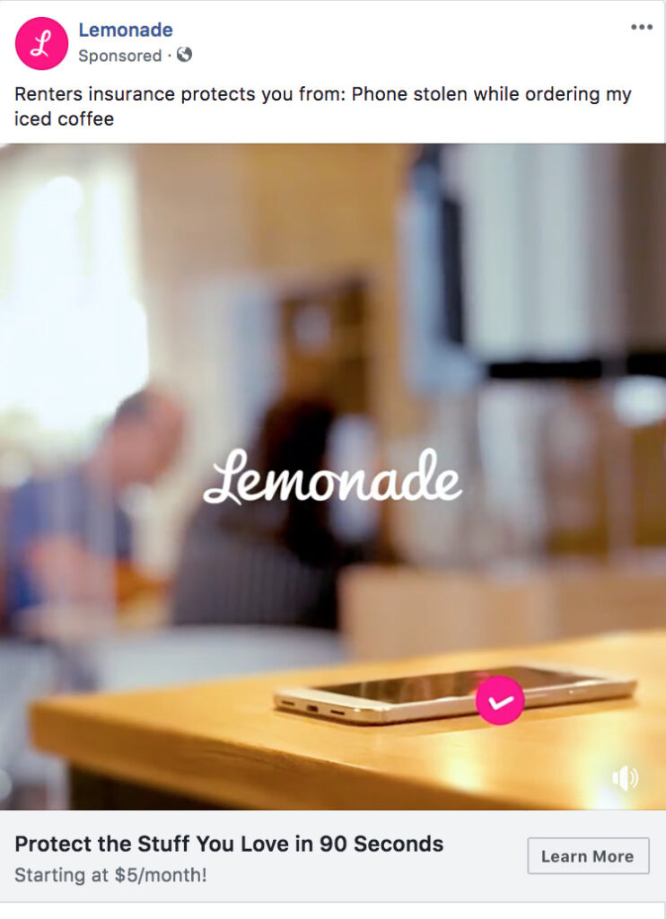
Insurance company Lemonade are known for their people-first approach to the insurance industry and this Facebook ad doesn’t disappoint.
Insurance ads often feel vague and impersonal. Lemonade makes it relatable by taking something specific — like accidentally leaving your phone on the table while you order coffee — and turns it into a story. This immediately makes the abstract concept of insurance feel much more real.
Experiment with short, story-driven ads that really connect with the user — videos like the one Lemonade used here can be a great place to start.
The lead generation ad: get your leads to an event
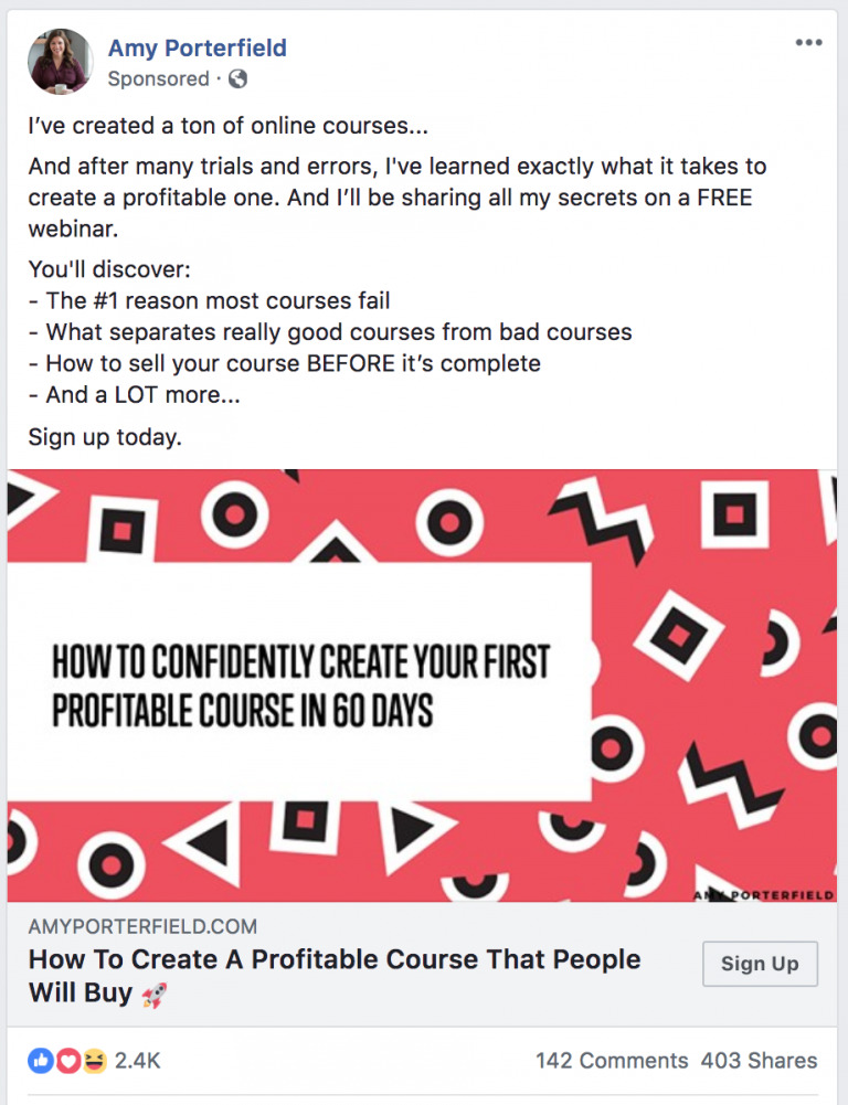
This Facebook ad from Amy Porterfield isn’t selling a product, it’s inviting people to an event (that will then sell the product). This is a traditional lead-gen funnel and can work exceptionally well.
It lowers the barrier of entry to interested leads who want to know more while capturing them into a funnel where they can be sold to.
The ad is simple and specific, it tells you exactly what you’ll get by signing up, both in the image and body copy.
The retail ad: local targeting
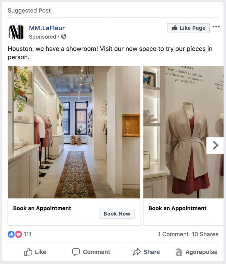
This ad from retailer MM.LaFleur uses local targeting to deliver ads about their newest showroom.
This is a great technique to use for bricks-and-mortar businesses, event organizers, and anyone who wants to reach people in a specific location.
The ad itself relies on the clean images the brand is known for, staying consistent with their tone and message.
The restaurant ad: using carousels
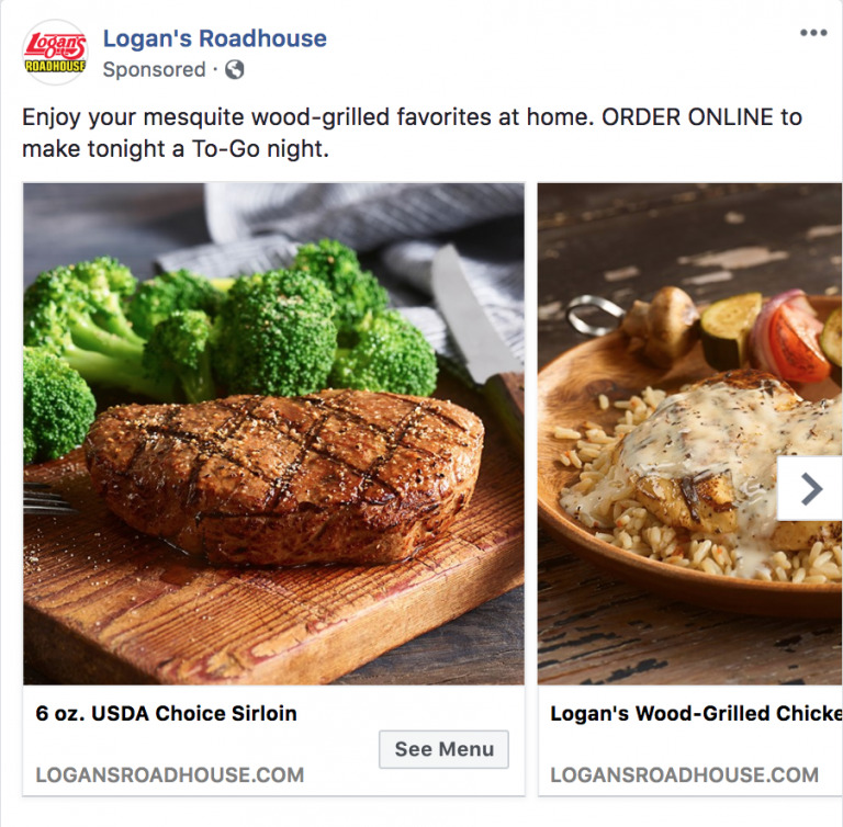
Facebook ads can work well for restaurants — especially those who take mouth-watering pics of their food.
Logan’s Roadhouse uses this ad format to draw attention to their online delivery. It positions itself as a competitor to more traditional take-out options with some great photography and diverse menu items.
Similar businesses can use this technique to move out of their expected niche and explore other profit-generation activities.
Create your own winning ad
We hope these ad examples from a variety of industries helped spark some Facebook ad ideas you want to experiment with right away. Luckily we’ve made it easy to do that, with our pre-made templates, so head over and start creating.

