Your website is all about telling your story, and a video background can be a big help in setting the tone and mood. They’re especially popular with certain types of websites, particularly professional, luxury, or ‘visual products’.
Besides being eye-catching, when used effectively, video backgrounds can encourage visitors to stay on a website longer and improve conversion rates. In this article, we’ll discuss some examples of effective background videos and how to incorporate one on your own website.
Background video examples
To be effective, website video backgrounds should draw visitors in without distracting from the content on your site. Ideally, the visuals will help establish the mood or tone, but you shouldn’t rely on your background video to inform or explain.
While you should include informative videos like explainers and sales videos on your website, your background isn’t the place for an in-depth explanation of your product. These are more effective when embedded on a page where visitors who want to learn more can click and watch them.
Here are a few examples of websites that are using homepage video backgrounds effectively, and why they work.

With soft lighting, soothing natural colors and textures, and shots of the luxurious, spa-like atmosphere, the video background on this website does a great job of setting a specific mood from the moment you land on the page.

This website uses a short, looping, black and white time-lapse video of the team at work. The high-contrast text and yellow buttons are eye-catching and fun, and create a professional image.

Landing on this website, you’re immediately immersed in rushing waves courtesy of the video background. These POV shots have a great energy that makes you not only want to head to the ocean and dive in (ideal for a surf shop), but also assume that these people live the surf lifestyle and therefore know what they’re talking about.

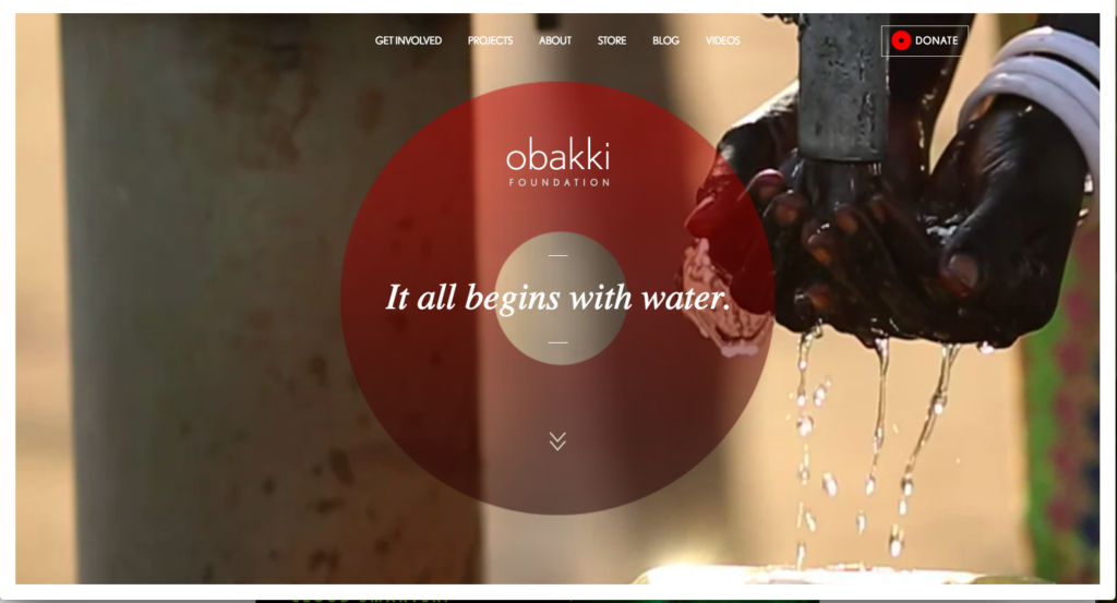
Video backgrounds are also well-suited for eliciting emotional responses, making them ideal for non-profit organizations. Here, a non-profit dedicated to providing water to people in need uses imagery of flowing water and shots of the people they help, in order to bring a sense of immediacy to their cause.
Background Video Dos & Don’ts
While they’re not ideal for explaining a complicated tool in detail, if you’ve got a highly visual product, a video background might be just the thing for your website. We briefly discussed why the websites above work — here are a few more dos and don’ts for using a video background on any website.
Don’t pick just any video. Just because it looks good doesn’t mean it’s right for your business. Make sure the imagery is relevant. That doesn’t mean you have to exclusively show your product, however, but think about the ideal outcome your product or service has. For example, if you’re a plumber, don’t show footage of pipes, show someone enjoying a shower or kids happily playing under a garden sprinkler on a sunny day.
Do limit the length of your video. Most of the videos above are quite short and loop seamlessly to give the impression of a longer video. Video files can be quite large; a short, looping video helps prevent the size of your background video from bogging down the loading time of your site.
Don’t distract from what’s important. Your video background should complement the content on your website, not distract from it. You still want your audience to read your copy, move through your site, and click on your calls to action.
Do make sure your content is visible. Make sure you’ve got a lot of contrast between your video and the content on top of it. You can use an overlay to add color or lighten/darken your video to ensure readability, or you can make your content a contrasting color (or both, like ThemePunch did in the example above.) In general, stick with muted colors in your video that complement the rest of the color palette on your site.
Don’t use a background video with sound. Just don’t. Autoplay videos with sound are a great way to make users close the window immediately. If your video has sound, make sure it’s muted by default.
Do consider usability. Take a look at your website analytics — what browsers and devices do most of your visitors use? Your website video background is no good to you if most of your users can’t see it, so make sure to use file types that are widely supported. Check out this article for specific tips on usability.
Don’t reinvent the wheel. Adding a video background can be as simple as uploading your video and clicking a button, or as complicated as writing lots of code, depending on your website. If you’re not a developer, save yourself a headache and use a plugin, theme, or website builder that supports video backgrounds.
- Do make it seamless. You want your video to look like the seamless background that it is, not like an embedded video. Hide the video controls and anything else that might distract the user.
How to use a background video
This can be a bit tricky for non-technical people, but your web developer should know how to set this up fairly quickly.
Typically background videos are set up using HTML5. It’s a matter of building out your page in HTML, styling it with some base CSS, and adding some code to layer the content while the video remains fixed and centered in the background. You’ll also need to add some code to control the video, including autoplay, mute, and loop.
For more in-depth instructions on setting up a video background with HTML5, check out this article. Note that website builders like Wix, Squarespace, Shopify, and the alternatives to Shopify also make it fairly simple to add video backgrounds. And if you’re using WordPress, there are plugins and themes that make it a seamless process as well.
Make a background video
With Biteable, you get access to 850,000+ stock footage clips . Many of these would be perfect for website background videos, particularly if you stick to just basic stock footage or animation.
Check out Biteable’s stock footage library.
Some other good sources for free stock footage include sites like Pexels, Coverr which specializes in videos for homepages, and Videvo which offers 3000+ pieces of free HD stock video footage.
Wrapping up…
When done right, a video background can engage your users and modernize your website, but consider whether this web design trend is right for your site.
If you’re ready to create your own, make sure you follow our dos and don’ts to ensure your video background helps you tell your story effectively, without distracting from it.

