Your internal company videos don’t have to be boring.
Keeping your videos on-brand for an internal audience might seem restricting. But the truth is, you can still make them interesting without sacrificing consistency and branding.
Sticking to a standardized style is especially important for internal comms videos. It actually helps people stay engaged far more than if you make unpredictable videos that throw out surprises left and right.
Here’s why it’s so important for your videos to stay on brand, and how to do it easily in Biteable Teams.
Why staying on brand is important
Creating a consistent brand for your videos actually helps you make more of an impact. Having a well-established video style also streamlines your production and saves you time.
Whenever you get the urge to go rogue, remember: consistency and branding are important. Keep the following points in mind.
Consistent style helps people process information
Predictability makes it easier for people to process the information in your videos. If they know what to expect, they can focus on the message instead of wondering where the video will go next.
Consistent branding and style also respects people’s time. If they have a sense of how long your videos usually take to watch and how much information they’ll get, it’s easier for them to determine how much time they need to allocate. This in turn makes them more receptive to watching.
Standards make it easier for the whole team to create videos
A standard video style makes it easier for other people on your team to pitch in and create videos, because they don’t have to make creative decisions about things like fonts and color schemes.
This also simplifies any approval processes you may have, because it’s easy to see if a video falls within the established standards.
Branded videos are best for external sharing
In certain circumstances, your videos might get shared externally. People might want to share a training video with colleagues at other companies, or a team member might pass on your company culture video to a friend who’s thinking about applying for a position.
Branding your videos ensures that your company gets credit (and possibly picks up some solid recruiting interest along the way).
Establishing brand guidelines for high-engagement videos
You don’t have to dig into all the nitty gritty of video design to create a strong brand for your internal videos. You can create a brand that looks great if you focus on a handful of core video design elements.
Standardize your colors and fonts
There are a ton of video elements that you can customize to build branding and style, but the big ones are colors and fonts. If you only do one thing to standardize your internal videos, do this.
Most companies already have brand colors and fonts. It’s easiest to stick with those colors for your videos, rather than creating a completely custom color palette. This saves time in video creation, but it also guarantees your videos match all your other resources.
(In a minute, we’ll show you how to easily apply your company colors and a standardized font to your videos using the Biteable Teams branding function.)
Establish video length guidelines
If your videos run too long, you’ll get diminishing returns, both in terms of engagement and information retention. Setting length standards helps you get the most benefit from your efforts.
A maximum of five minutes is a good overarching limit for all your internal videos. Within that, you can establish a few ranges for specific video types.
- Five minutes for training videos
Training is some of the most information-dense content, so it’s wise to use all of your video minutes to keep things manageably paced.
- 2-3 minutes for updates and info-sharing
Leadership messages, product updates, quarterly results, and any other information-sharing videos should be short to ensure people can watch it during their workday without missing anything.
- 15-30 seconds for announcements
If the video itself isn’t the main event, it’s best to keep things as short as possible. Nobody wants to spend three minutes getting the details of an upcoming holiday or an all-hands meeting.
Keep in mind that your videos can always be shorter than the maximum. There’s no downside to making a video shorter, as long as all the information is included.
Lastly, the content should dictate how many videos you make. A series of short videos that covers a complex topic is much easier to consume than a single, long video.
Avoid mixing animated characters with live footage
If you’d like to use animated characters in your videos, it’s best to pair them with animated graphics, rather than mixing animated characters with live footage.
There’s a reason that very few live-action movies include cartoon characters: it usually looks awkward.
If you’d like to use live footage in your video — stock footage or recorded clips of people on your team — limit your animation selections to graphics only. Animated text, charts, and graphs won’t clash with the live footage.
Animated characters are amazing for showing human action, without the extra effort of shooting footage. But if you use live footage, it’s best to let it speak for itself.
Add an intro scene
Create a very short intro scene and re-use it for all your videos. This type of consistent presentation creates familiarity and gives viewers a sense that they know what to expect. Also, consistent intro scenes give your videos an extra touch of professional production.
(No worries if you don’t know how to make an intro. There are plenty of brandable intro scenes available in Biteable Teams.)
If you’d like to go one step further with your intro scenes, you can create a unique intro for each type of video. Your sales enablement videos will have their own intro, HR videos will have another, and so on.
That way you have varied intro scenes, but they still serve the purpose of building familiarity and setting up expectations right from the start.
Always include your logo
This might seem unnecessary for internally shared videos, but don’t underestimate this subtle step. It goes a long way toward giving your videos a sense of polish and a standardized look and feel, even if people don’t consciously register the logo.
When you use Biteable Teams branded templates and scenes, your logo will automatically be applied to your videos.
Using the Biteable Teams branding function
With the branding function in Biteable Teams, you can automatically apply our company colors, logo, and a standardized font to all of your videos. Here’s how.
1. Select “edit brand”
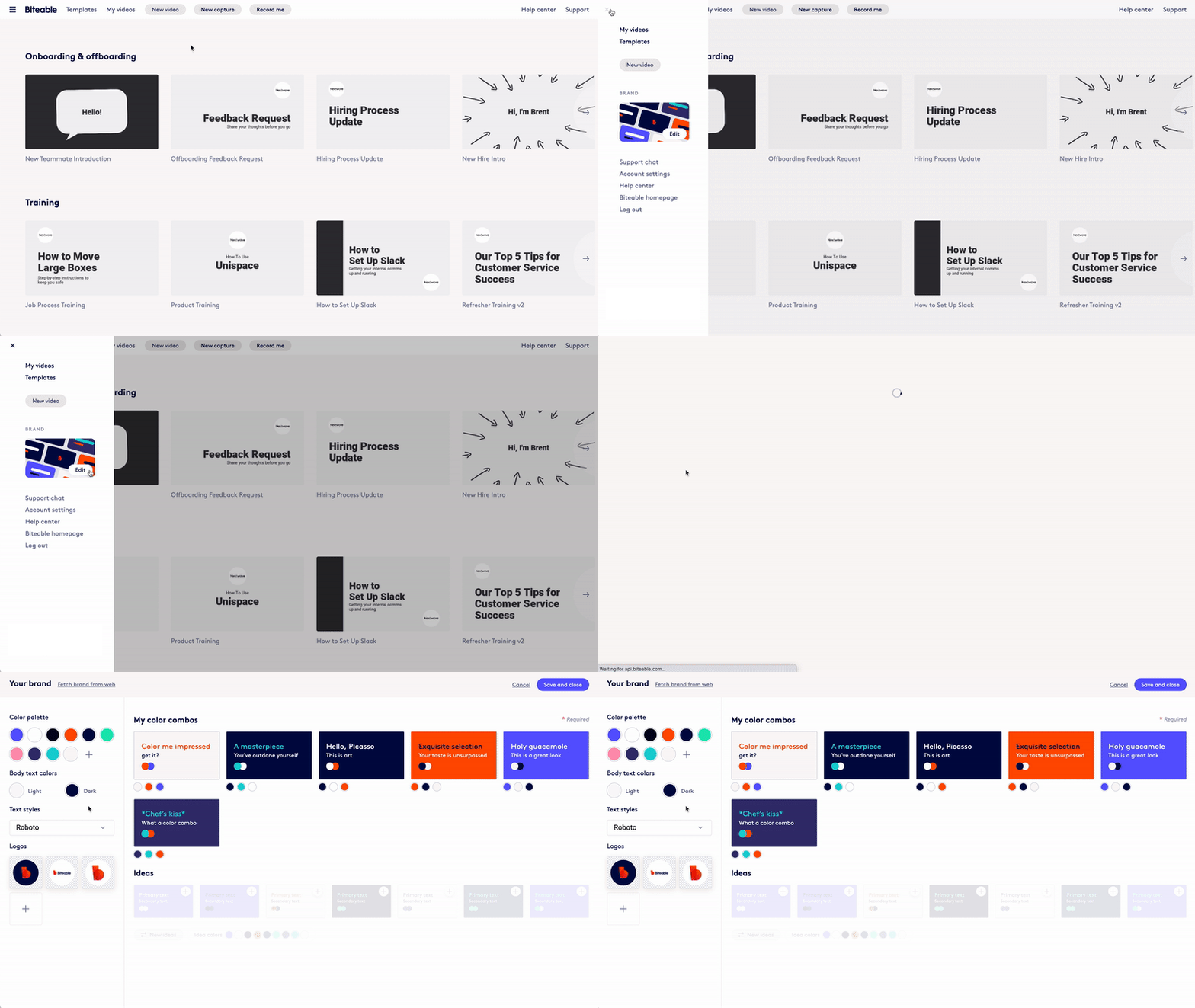
From your Biteable Teams dashboard, click the top left menu icon, then select Edit under the “Brand” heading.

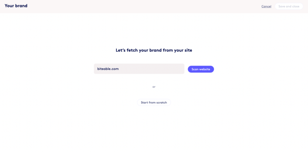
2. Fetch your brand
Enter your company’s homepage URL to automatically fetch your brand colors and logo. (Don’t worry, you can change these at any time. This step just streamlines the process.)

3. Select your color schemes
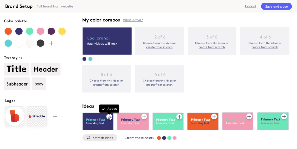
The brand creator will auto-generate several color combination ideas based on the brand colors from your website.
Select up to six color schemes or create your own with colors from the color palette on the left. Or click create from scratch to build your own color combinations.
If you want to use colors that didn’t pull from your website or customize the fetched colors, that’s no problem. Click a color circle in the color palette and enter the hex code for the color you want. Or click the + sign to add another color to the palette.

Quick tip: Avoid adding too many colors to your brand or using multiple colors that are very similar.
Too many colors makes your brand feel inconsistent because you could end up with an entire video where no color appears in more than one scene. Likewise, including multiple colors that are too similar increases the chance you’ll have awkwardly subtle color shifts from scene to scene.
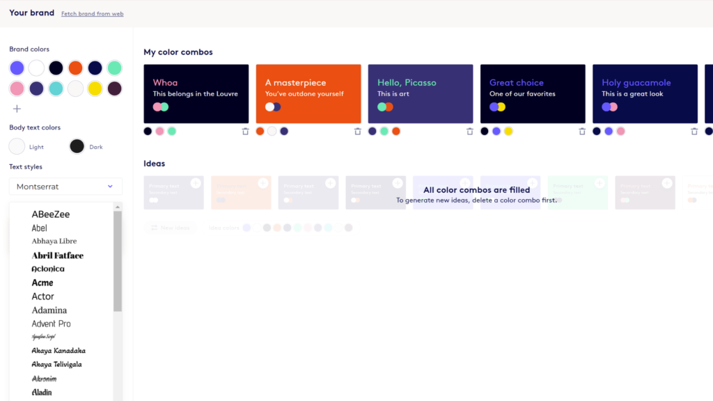
4. Choose a font
Choose a font from the dropdown menu and it will automatically be applied to all of your videos as a default. (You can make font changes within any given video.)
Biteable Teams includes a wide selection of Google fonts. But if you’d like to use a custom font, reach out to your customer success manager (paid Teams users only) with your custom font files and we’ll add them to your account.

5. Customize or add additional logos
In the brand screen, you can customize your logo by changing the frame size or adding a background color, or upload additional logos.
Quick tip: Add a few logos with different background colors, so you have a logo that either matches or contrasts with your video backgrounds.
6. Save and create
Now that you’ve created a brand, Biteable Teams will automatically apply your color combinations, font, and logo to any brandable template or scene.
When you edit your video, you can always change the color scheme or the colors for any given video frame.
Once your brand is set up in Biteable Teams, anyone with access to your Teams account can create videos and the branding will always be consistent, without any additional oversight.


