Data visualization is a powerful means of conveying information effectively, and creating visually captivating charts is an art in itself.
In this blog post, we will explore our top graph tricks that will help you transform your charts into visually stunning masterpieces. From selecting the right chart type to incorporating visual elements, we’ll delve into techniques that will elevate your charts from ordinary to extraordinary.
From there, quickly turn your chart into unmissable video presentations with the Biteable video maker.
The power of beautiful charts
Charts play a crucial role in data communication due to their inherent advantages over text-based information. Here’s why charts are important and how they enhance the presentation of data:
Quick and easy to understand
Charts allow us to comprehend complex information swiftly. By presenting data visually, charts provide an immediate overview and enable us to identify patterns, trends, and relationships without extensive analysis.
This visual representation simplifies the interpretation of data, making it easier to grasp and retain key insights.
Engaging and memorable
Charts are inherently more engaging than long blocks of text. Humans are visual creatures, and our brains are wired to process and remember visual information better than text alone.
The combination of colors, shapes, and visual elements in graphs creates a memorable experience, leaving a lasting impact on the audience.
Clear and concise
Charts facilitate clear and concise communication. By condensing complex data into intuitive visual representations, charts enable us to communicate the essence of information succinctly.
Charts allow us to present a story, highlight important data points, and emphasize key messages effectively, ensuring that the audience understands the main takeaways effortlessly.
Comparison and analysis
Charts enable easy comparison and analysis of data sets. By visualizing data side by side or overlaying multiple data series, charts allow for quick identification of similarities, differences, and trends.
Comparative visualizations help us uncover insights, make informed decisions, and support data-driven arguments more effectively.
Create videos that drive action
Activate your customers or team with impactful, on-brand videos.
Tips for creating beautiful charts
1. Choose the right type of chart
To create beautiful charts, selecting the appropriate chart type is crucial. Excel offers a wide range of options such as line charts, bar charts, pie charts, and more. The choice of chart type depends on the data you want to present and the story you aim to tell.
Here are some considerations and common use cases for different chart types:
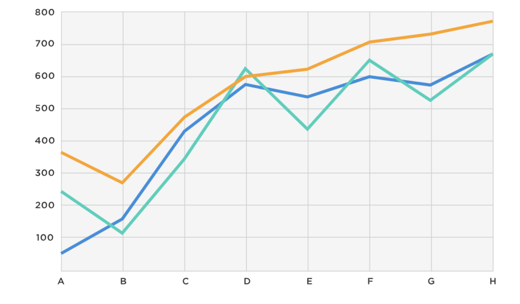
Line charts
- Use line charts to show trends over time or continuous data.
- Line charts are ideal for displaying data with a clear progression or correlation.
- Common uses include tracking stock prices, analyzing temperature variations, or depicting sales trends over a specific period.

Bar charts
- Bar charts are suitable for comparing categorical data or discrete values.
- Use them when you have distinct categories or groups that you want to compare.
- Bar charts work well for displaying sales by product, comparing population sizes by country, or showing survey responses for different options.

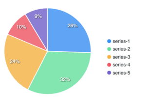
Pie charts
- Pie charts are effective for illustrating the composition or proportions of a whole.
- Use them when you want to show how individual parts contribute to the total.
- Common uses include representing market share for different companies, depicting the percentage distribution of a budget, or displaying the distribution of different types of crime in a city.

Scatter plots
- Scatter plots are used to visualize the relationship between two continuous variables.
- They are helpful in identifying patterns, correlations, or outliers in data.
- Scatter plots are commonly used in scientific research, analyzing data points for height and weight correlations, or examining the relationship between advertising expenditure and sales figures.

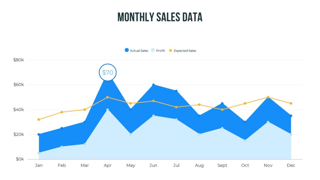
Area charts
- Area charts are similar to line charts but are filled with color to represent the area below the line.
- Use area charts to show cumulative data or to compare multiple data series.
- They are commonly used to display changes in market share over time or to represent the cumulative percentage of a budget spent over a period.

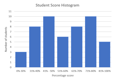
Histograms
- Histograms are used to display the distribution and frequency of continuous data.
- They are particularly useful for understanding the shape and spread of data.
- Histograms are commonly used in statistical analysis, such as analyzing exam scores, measuring the distribution of heights or weights, or understanding income distributions.

Remember, these are just a few examples, and Excel offers numerous other chart types to suit different data types and purposes. When choosing a chart type, consider the nature of your data, the story you want to tell, and the insights you want to highlight. Experiment with different chart types to find the one that best represents your data and effectively communicates your message.
By selecting the right chart type, you can ensure that your data is visually presented in a way that maximizes understanding and engagement.
2. Think about formatting
Effective formatting plays a vital role in enhancing the visual appeal of your charts. Consider the following tips:
Use color wisely
- Opt for a harmonious color palette that is visually pleasing.
- Avoid overloading the chart with excessive colors, as it can lead to visual clutter.
Maintain consistency
- Choose a consistent color scheme, font, and style throughout the chart.
- Consistency in design creates a polished and professional look.
Keep it simple
- Avoid overcrowding the chart with unnecessary elements or excessive data.
- Focus on presenting the key insights in a clear and concise manner.
Provide clear labels
- Ensure your chart has a descriptive title and axis labels that accurately explain the data being represented.
3. Add your visual elements
Incorporating visual elements can take your charts to the next level. Consider the following techniques:
Use data labels to highlight key data points
- Highlight significant data points or trends using data labels.
- Data labels draw attention and make it easier for viewers to interpret the chart.
Add trendlines to show patterns
- Display patterns and trends in the data by adding trendlines.
- Trendlines provide a visual representation of the data’s trajectory.
Use shapes to highlight areas of interest
- Emphasize specific areas of interest in the chart using shapes like rectangles or arrows.
- These shapes serve as visual cues and direct attention to key details.
Turn charts into unmissable video presentations
To maximize the impact of charts and enhance their engagement, consider integrating them into video presentations using the Biteable video maker. Video presentations offer additional benefits in conveying information effectively.
Create an (even more) engaging visual experience
Video presentations provide a dynamic and immersive visual experience. By combining visuals, animations, and audio, they captivate the audience’s attention and maintain interest throughout the presentation.
Borrow the power of storytelling
Videos allow for effective storytelling, enabling you to weave a narrative around the data presented in the graphs. By combining the power of visuals and storytelling, you can create a compelling and persuasive presentation.
Boost retention
Studies have shown that the combination of visuals and audio in videos enhances information retention. When graphs are integrated into video presentations, they become more memorable and leave a stronger impact on the audience.
Create unbeatable presentations with Biteable
Charts are indispensable tools for effective data communication. They enable quick understanding, engage the audience, facilitate clear communication, and support comparison and analysis. By leveraging Excel chart tricks, you can transform your charts into visually captivating representations of data.
Embrace the power of charts and video to elevate your data presentations and captivate your audience like never before. Start your free 7-day trial of Biteable today.

